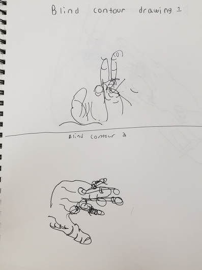
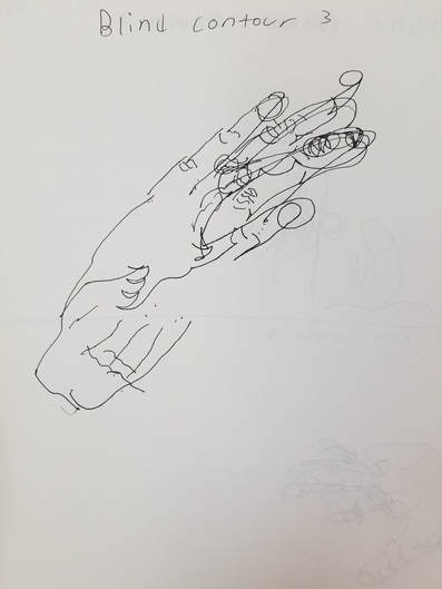
Here are my three blind contour line drawings, these were very hard to do. The blind hand drawings were important because they taught me to draw what I see not what my mind thinks an object looks like. It was difficult to make them look even remotely like hands.
|
|
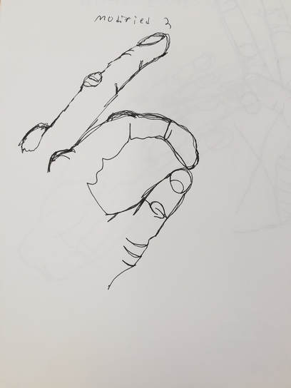
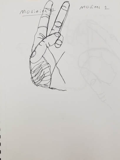
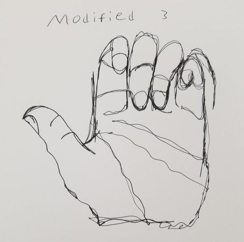
This is my three modified contour hand drawings. They were much easier to do over the blind ones but I still found them difficult due to being used to be able to take my pen off the page. These continued the lesson of drawing what you see in order to get the correct shape of the hand down.
|
|
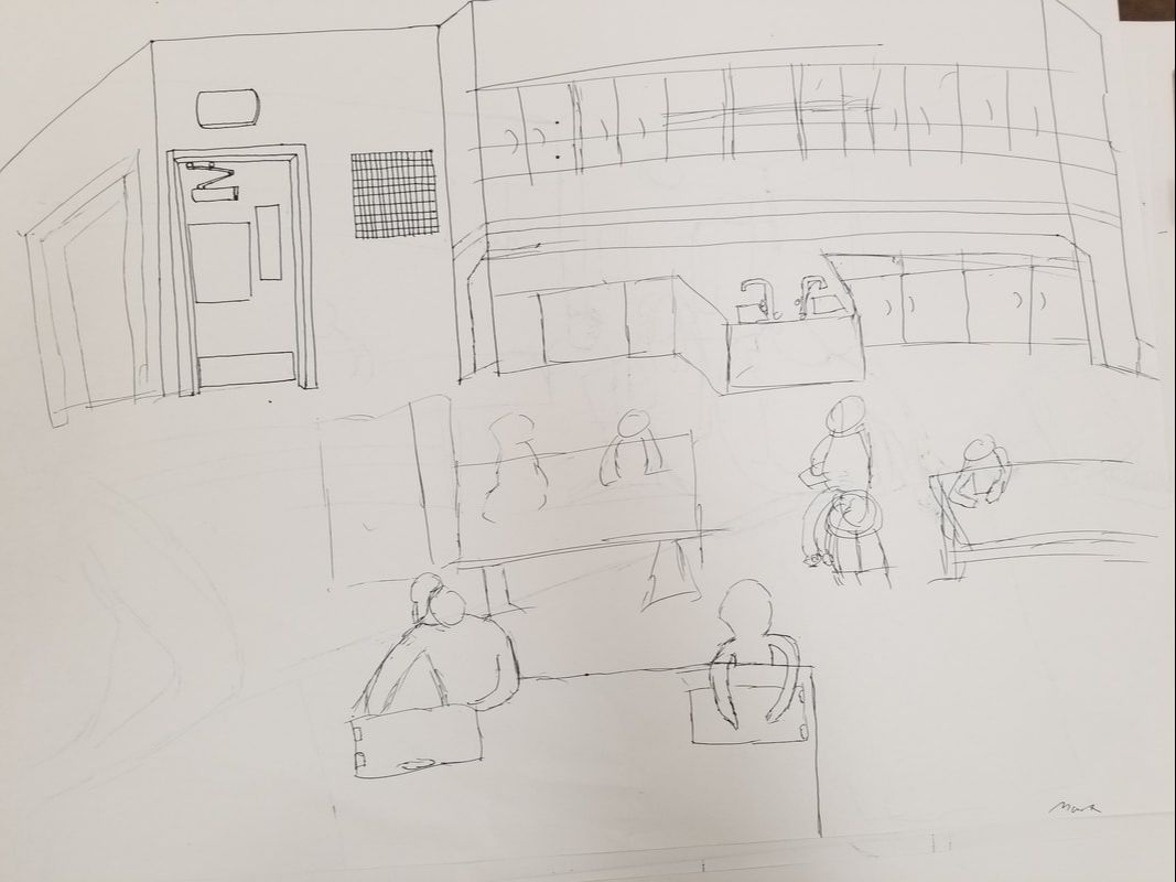
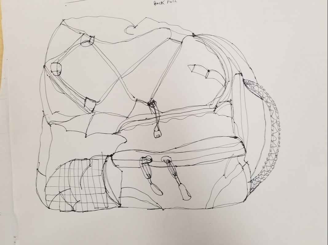
Here are my contour backpack and contour room practice drawings that helped prepare me for my final contour room drawing.
|
|
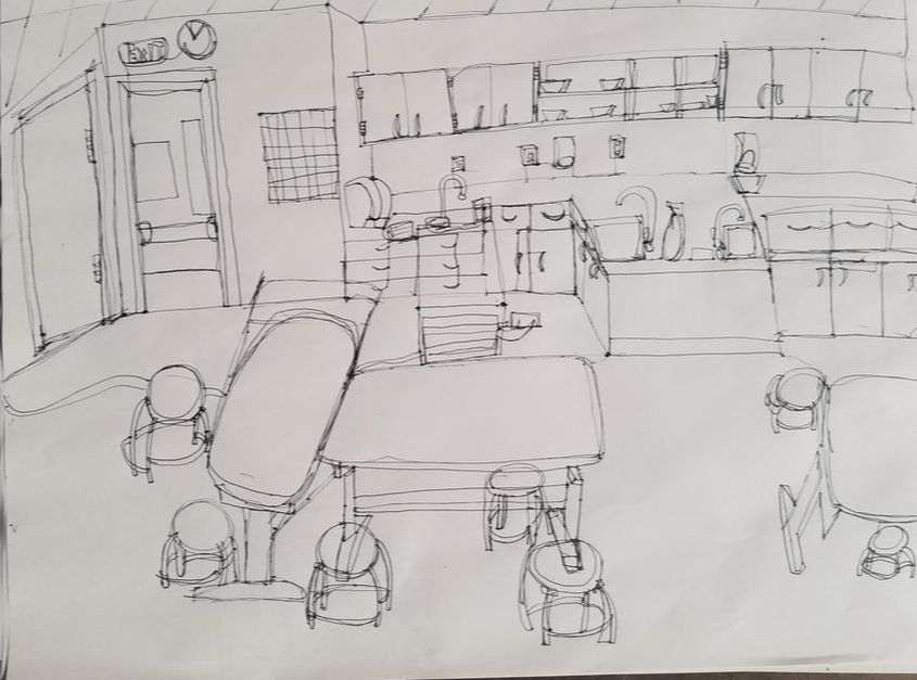
1. Did you use a fluid line? Explain how is this evident? I believe that in some parts of my drawing fluid line was done well while in others i went back and forth to much creating a scribbling look to the line. This is evident in the left most table where i went back and forth too much causing the table to look messy and non fluid. An area where I made my drawing look fluid is the clock where i believe the circular lines gave the clock the correct fluid shape.
2. Explain how your knowledge and creating practice studies with contour line contributed to the success of your piece. The biggest why that in which the practice helped me was by drawing what I see not what my brain thinks something should look like. This is why the modified and blind hand drawings were so useful they made me focus on what the hand actually looked like for instance by making us draw the hand as the same size as our hands it give me a better idea on how to use perspective in my final drawing.
3. Describe the difference in your contour line drawing to an outline drawing. An outline drawing is drawing the edge of a shape in order to give the outline of it while a contour line drawing is made to give the true shape of an object to make it look 3d.
4. Explain how your interpretation of line is essential in capturing the look of the room. It's important to draw lines at certain angles in order to give the 3d shape of an object. An example of this would be the part of the room that has the sinks on it, i had to put the lines at the right degree to make it seem closer to the viewer than the cabinets behind it.
5. The biggest thing I learned in this drawing was to draw what I see which I still find very difficult. I also learned about the importance of the fluidity of lines in order to give objects a 3d shape. If I were to redo this drawing I would have tried and not gone back and forth between my lines as much, but have planned out my lines in advance in order to give the drawing a neater look to it.
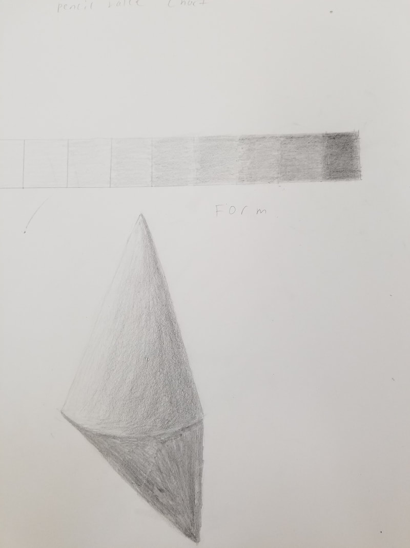
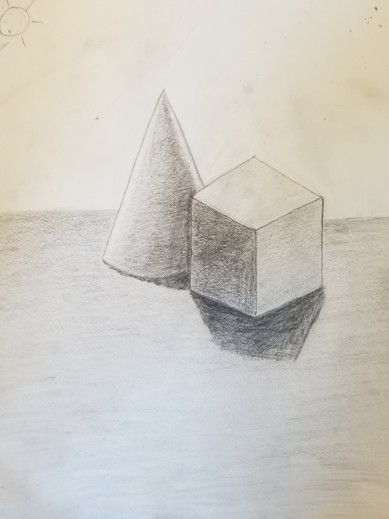
Here are my still life graphite pencil shapes and my value chart. I really liked doing this still life since I felt like I really learned a lot about value while doing it especially from the video that showed how a cone needed a reflective highlight on the opposite side of the lighting which was great information.
|
|
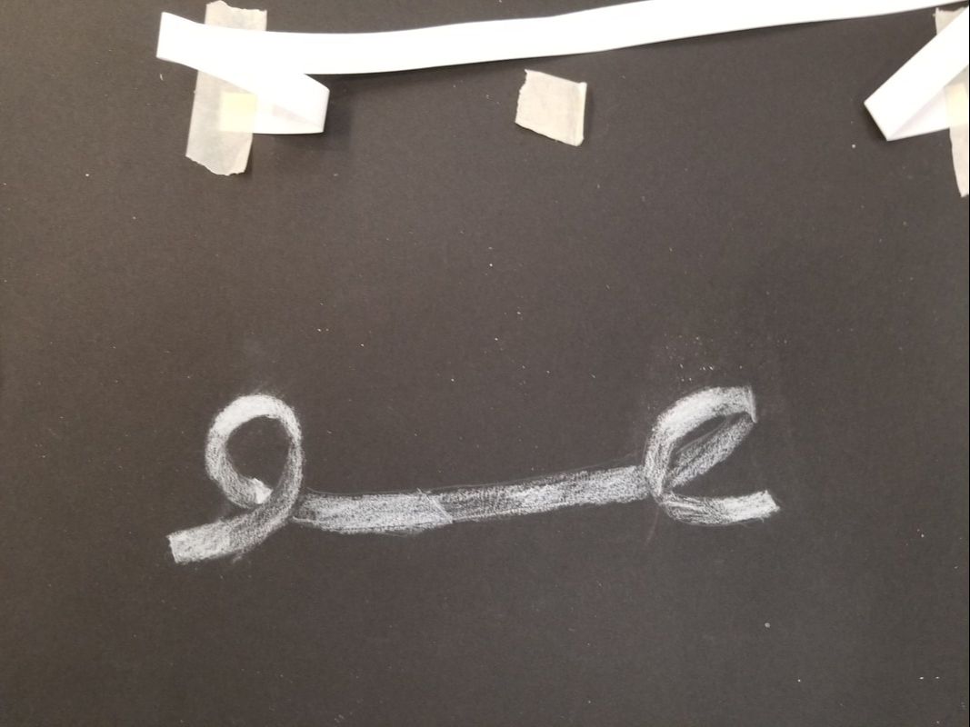
Here is my white ribbon and white value chart with white forms also. Doing the ribbon was good practice for the fabric drawing that we had to do later in class since it was an easy introduction to drawing value that way.
|
|
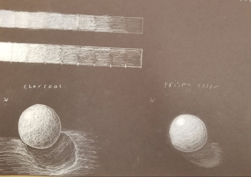
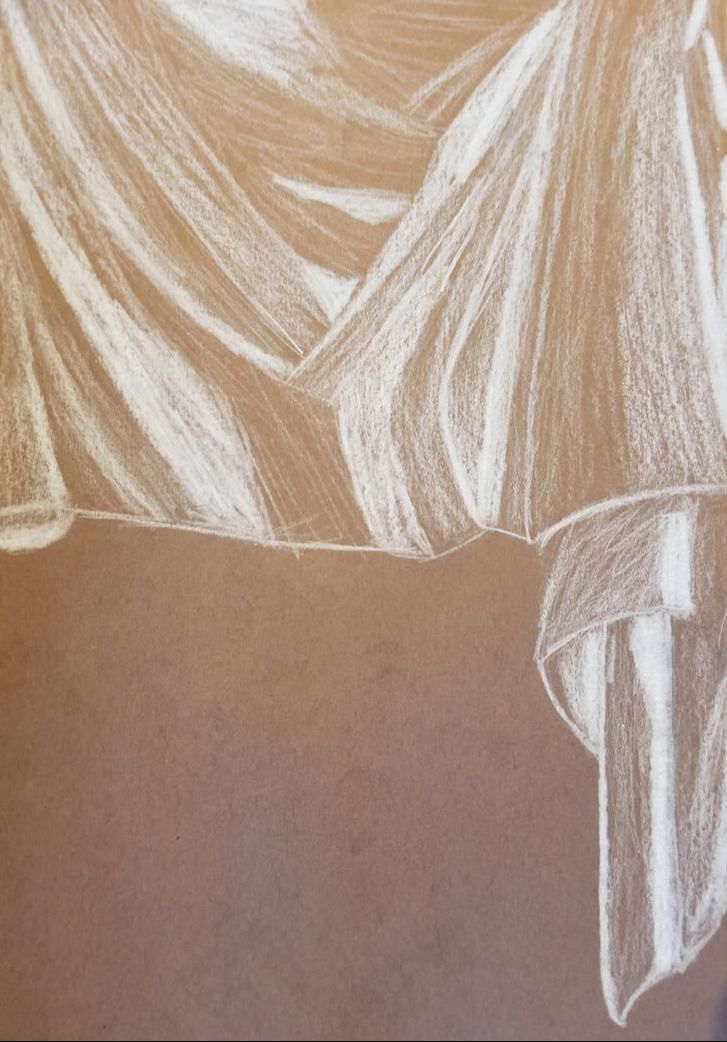
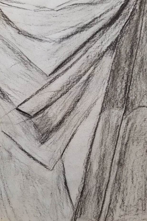
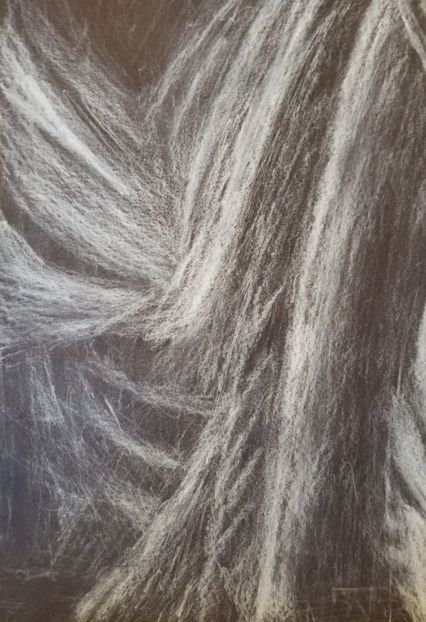
Here are my fabric white prisma, white charcoal, and black charcoal practice fabric drawings. The prisma is on brown paper and the white charcoal is on black. My first couple attempts did not go so well but I felt like my white prisma drawing was done quite well after I had practice.
|
|
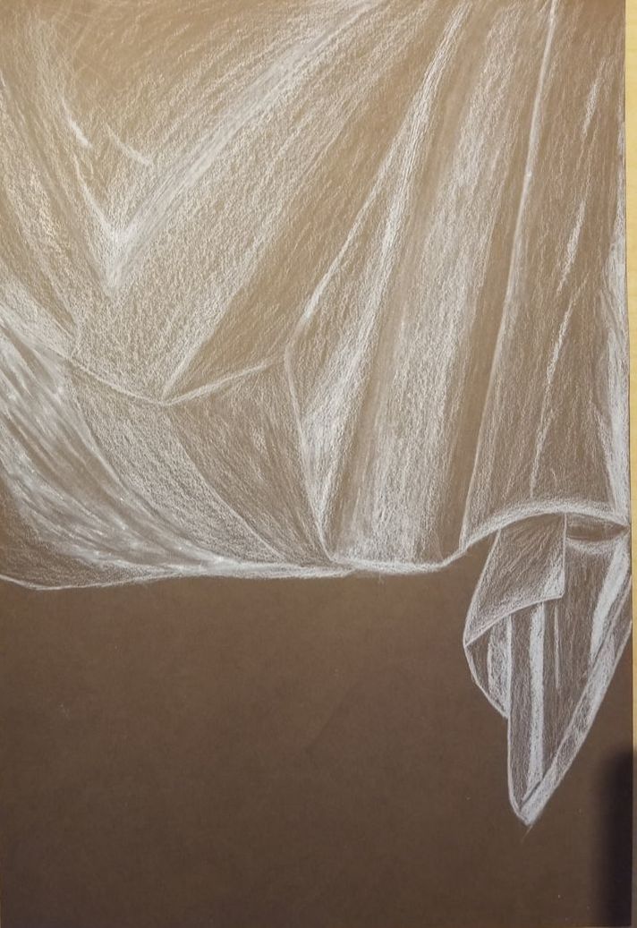
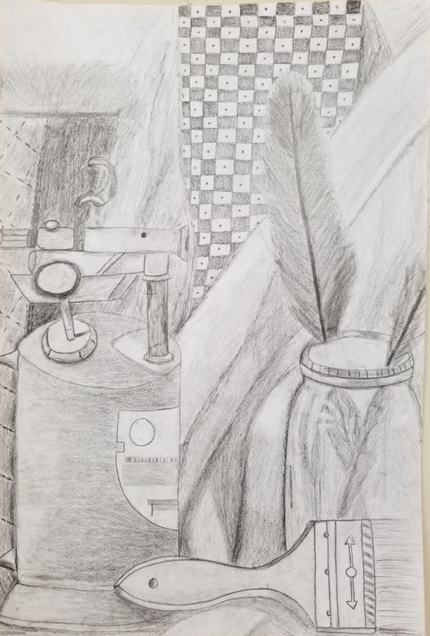
This is my final drawing of the fabric and questions.
- Did you use a wide range of values? (A range from white to black with at least 9 values). Explain how is this evident?
- Explain how your knowledge and creating practice studies with value contributed to your piece.
- Describe the blending and transitions in your fabric (discuss your use of pressure with pencil/colored pencil/charcoal pencil and other techniques to achieve this).
- Explain how your interpretation of texture is essential in capturing the look of the object.
- If you could recreate your pieces what would you do differently to enhance the final outcome?
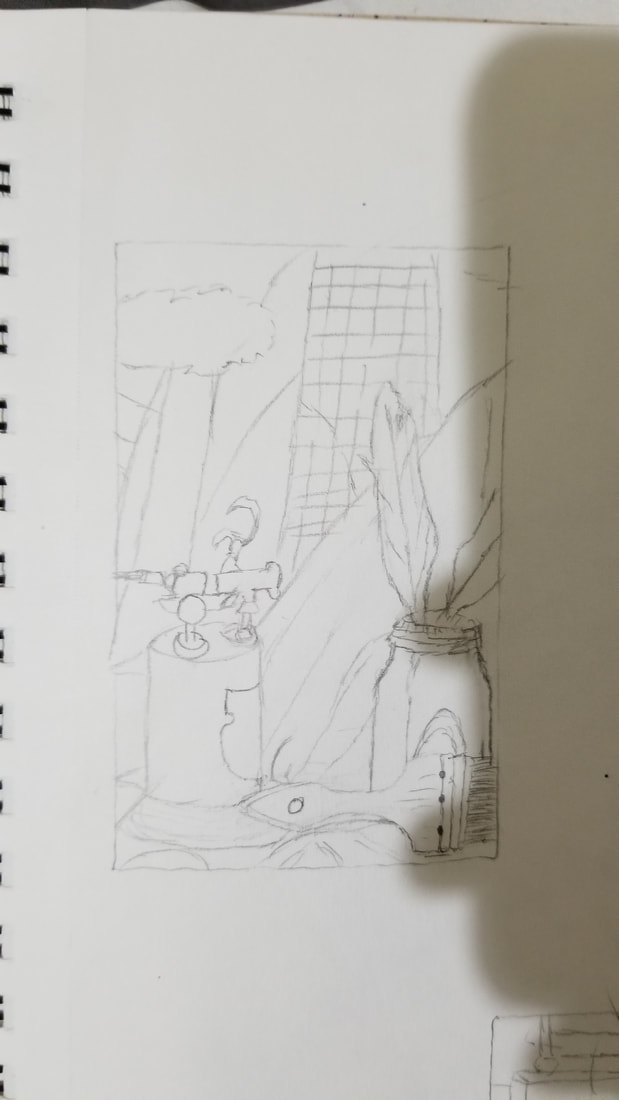
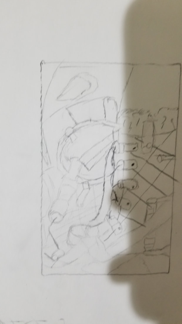
Here are my three compositional photos for my still life.
|
|
|
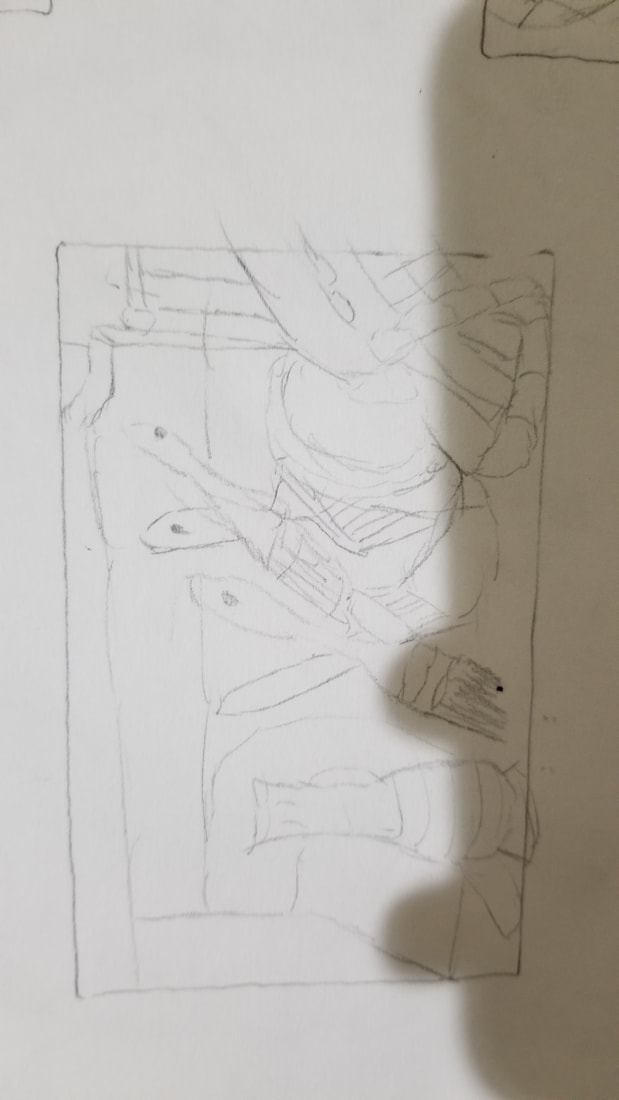
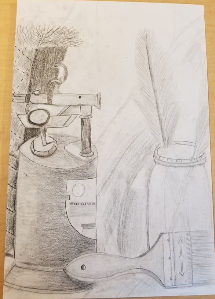
Here are my two inprogress photos of my still life alongside the final drawing. It is nice to see how a drawing can be really brought to life by adding value, It is interesting how the darkness of a line really puts the drawing into perspective.
|
|
Drawing critique for my still life:
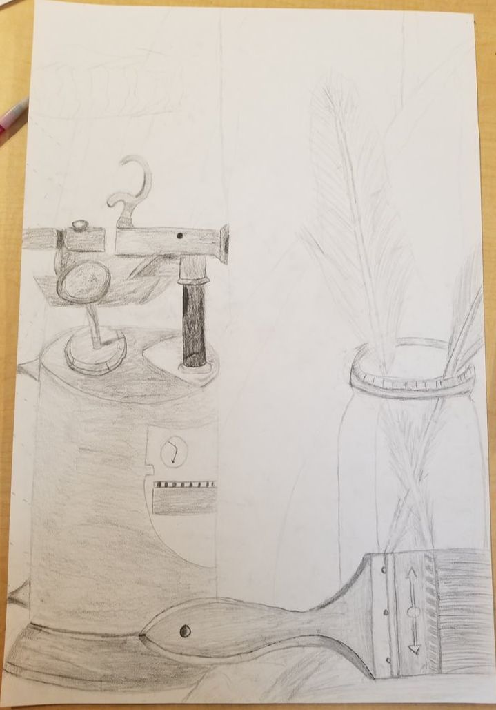
1. I believe I had good craftsmanship for my level of ability it is quite easy to tell what is what and I don't see any smudges that muddy up the space of the objects I drew. You can clearly see where one objects begins and where another ends, for instance the bottom part of my drawing, the jar, paintbrush, and object I have no idea on what it is are all clearly distinguishable from each other. I also feel that my objects are blended well in most areas, for instance my jar which i feel that i blended quite well to showcase the opacity of the jar. I think some areas could have been drawn a bit neater if i had a steadier hand in certain places.
2. I think that my shadows and other places of value are realistic especially in the jar and fabric behind the objects. I think the jar is the best example of how I used value to create realism in my piece. It has a clearly defined edge that shadows the fabric putting the fabric behind it. Then the transition of lights and darks give the jar a rounded look to it while also showing that it is see through. I also placed my highlights on the jar in a realistic placing which I feel help to give it that see through look that it needed to be realistic looking. I also used varying degrees of dark and lights on the fabric to give it the depth that it needed to look 3d. You can clearly see which fold is in front and which fold is in back due to my usage of value.
3. I think their is a clear source of lighting shown to be coming from a bit overhead to the left of the objects. This can be seen in the highlights of my jar, and the shadows on top of the object that I have no idea what it is. You can also see where the light source is due to the shadows in the fabric since they are behind the objects in which the light is hitting they are clearly darker than the rest of the piece, and this is also seen the side of the boot due to its darkness.
4. I think the compositional sketches were slightly important because it was necessary to see which point of view would give an interesting piece. They helped my select a view that I thought had enough going on in it to make my piece interesting. They were also good practice for figuring out how to proportion your drawing.
5. I think my drawing is quite the hit and the miss, some parts came out really good looking while others came out pretty mediocre. For instance most of the objects came out really realistic looking like the comb and the jar, while others like the boot came out pretty bad. I did not know how to do certain textures like the fur on top of the boot, but for some reason it was easier for me to figure out things like the shading on the jar. I actually like my drawing I think it was one of my better pieces I have done, and I am glad it came out better than I expected of myself. I wish I had been able to draw certain things better in the piece, but overall I liked a good amount of it such as the folds between the weird object and the jar. I think the composition of the drawing is also successful in that it has enough to look at to be interesting to the viewer.
6. I believe that i proportioned everything in my piece pretty well towards their true proportions. The jar and comb are quite well proportioned which I think can be easily seen, and the weird objects main body is well proportioned. The main place where my proportions look off is the top of the weird object since it had so much going on in the top it was hard to correctly draw the structure of it in a manner that made it look true to its original shape. I think the folds of the fabric were drawn correctly to their true shape also.
7. I personally really liked the composition of my drawing, and I think I chose an interesting angle to draw. There are heavily detailed objects in the foreground while the background has more simple objects like the tie. This causes the background to not take away from my foreground while keeping enough detail in the background to not make it boring.
8. I actually feel like the folds between the weird object and the jar could be the center of interest mainly because it's what i first look at when I view my piece. If it is the center of interest its not really well located since its pretty much in the middle of my piece
9. Normally on most projects I spend way too much time goofing off and sitting on my phone, but I am trying to rectify that issue. I think this project I used my time better than I had in the past, and did not spend as much time on my phone but more on drawing. Of course I goofed off at times when I felt overwhelmed, but I tried to make up for the lost time by actually working on my piece from home. I feel that I have a chronic problem with motivation and focus, so I hope to be able to learn better ways to stop distracting myself so much. One of these methods I actually have tried to use is to work in shifts, and I feel that it helps a lot to work for every 30 mins with small breaks in order to take my mind off of frustration I may feel.
10. A big challenge I faced was putting in a full range of value especially with the shadows. It was hard for me to really exaggerate the dark values to make the piece become more realistic looking since I did not really see them myself before adding them. Another problem I faced was trying to create the texture of the feathers and the fur on the boat to look realistic. I just did not really know how to properly layer lines to give them a realistic look, and I feel that it is a lacking part of my project.
11. I feel like I really learned a lot from this still life especially when trying to make objects look realistic like the jar. I learned a lot about value with this project and really put into practice the work I had done on the forms we had done into this piece to give it a good range of value. This was a great project also since there was so much variation in the objects that made me have to really put a lot of effort into every piece to correctly draw them. Drawing the jar was also great for me since it gave me a better feel on how to draw the opacity of objects.
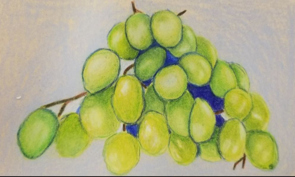
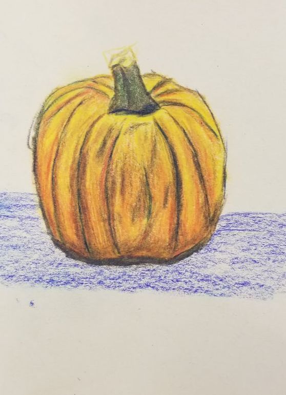
Here is my pumpkin and grapes prisma color practice drawings. These were great practice for separate reasons, and both helped me with my final project. The pumpkin was good practice since it helped me learn how to create texture in an object by layering colors in order to give the shape of the pumpkin. The grapes were really great practice with using a variation of colors to give value to the grape and to showcase their oval shape. It was also good practice with the grapes since the position of them made me have to focus on the shadows in order to make the grapes have the illusion of being in front of and behind of each other. Another thing I learned from the grapes and pumpkins was to put in colors I did not necessarily see like dark blue for shadows in the grapes.
|
|
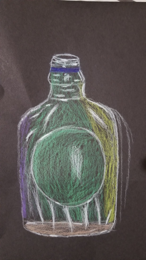
Here is my drawing of glass in order to learn opacity. I tried to do this many times and to be frank I don't really think that I got, which mainly was due to getting quite frustrated by the project. I tried to do the glass drawing with different pieces of glass but ran into the same problems of just not knowing where to add color. I did not find it hard to find the highlights of the piece but I found it difficult to fill in the rest of It in a manner I actually liked. I lost the one I had liked the most sadly so I am having to post my second choice of the glass drawings I did.
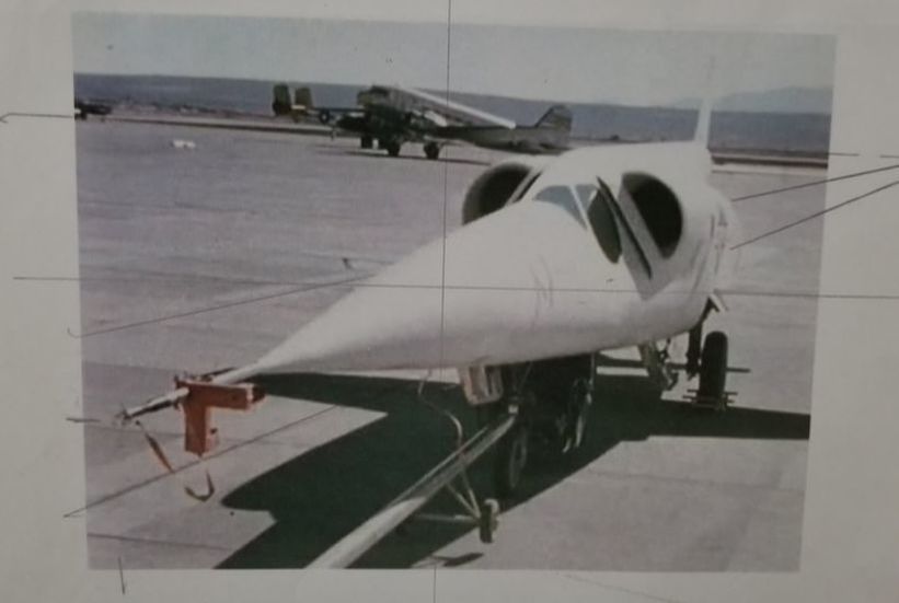
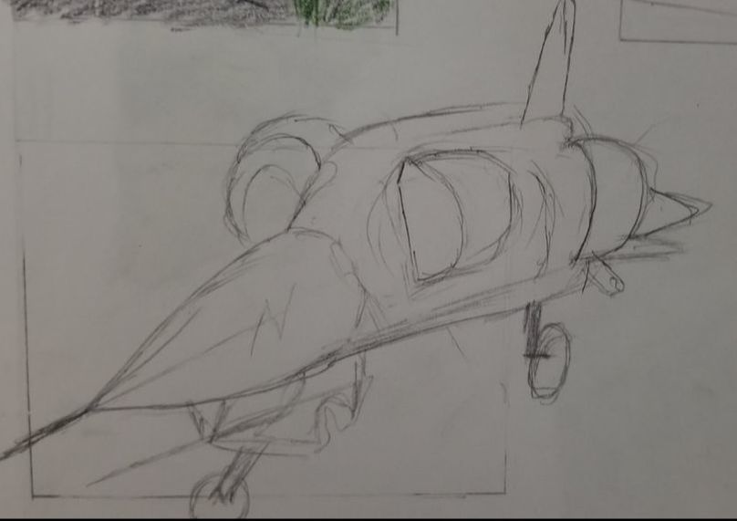
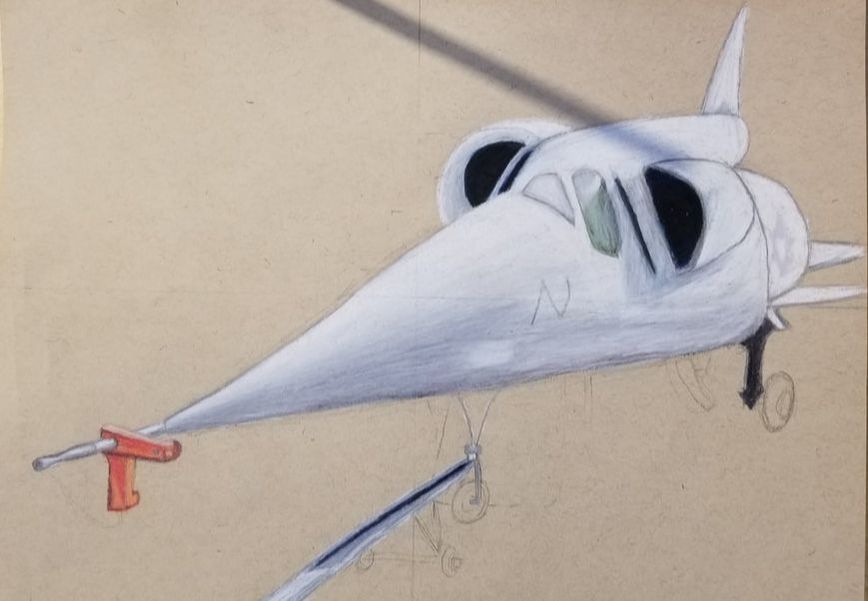
Here is my compositional sketch of my foreshortening piece, and the reference photo i used for my final drawing
|
|
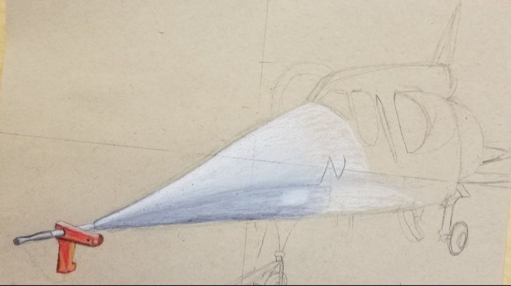
Here are two in progress photos of my final drawing.
|
|
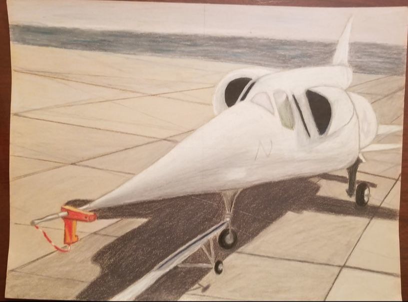
My final drawing
Foreshortening project critique questions:
1. My drawing had an interesting point of view due to the angle of the photo I found of a douglas x3 stiletto that was extremely foreshortened. The plane I had chosen was an extremely long and narrow plane when viewed from a normal point of view. The photo I had chosen was also interesting looking due to being able to seen under the plane which showed the trolley thing it was on which added some nice details. It was also interesting to be looking at the plane's engines and windows which I personally thought looked cool in a futuristic way, and the red thing on the nose of the plane add an interesting contrast with its red color. I think the point of view was very successful.
2. Perspective is very important in order for your drawing to get the correct proportions otherwise your drawing would just look off and lumpy. Without proper perspective your drawing can end up looking flat and 2d, if your use proper perspective it can create a very realistic and 3d drawing due to giving an illusion of space and depth. Every artist needs to learn proper perspective to really elevate their work from just a normal drawing.
3. The colored pencil exercises were fairly helpful mainly because they were just even more practice. The more times you practice an art medium the better you will get, practice makes perfect. Doing the prisma color grapes were useful to me since I felt like I had finally started to learn better how to properly blend prisma colors without losing highlights in my drawings. Learning how to blend in a better fashion helped a lot with this project due to the fairly one color look of the plane, so I needed to blend the shadow on the plane out very well without making it look like a different color of the plane altogether
4. I think I did quite well with my craftsmanship on this drawing, and I feel like it is seen in my drawings blending of colors. I spent a lot of time blending with the prisma color to get the shadow I wanted on the plane in order to give it value that showed its cylindrical shape. I tried also to get my lines to be very neat to the best of my ability, for instance at the nose of the drawing I took a lot of time to draw the shape of the very tip on the plane, and I think it shows by how close it looks to the picture. Most importantly was properly layering different colors on top of each other without losing highlights or mudding the drawing. I layered most of the drawing pretty well, but in certain areas it looks lacking like in the trolley for the plane, the wheels on it look sloppy since I added to much dark which ruined the highlights and shape of it. Overall I think I did a pretty good job on making this project look neatly executed
5. I think my painting had good depth to it due to the shadow below the plane, and the foreshortening of the plane. The shadow under the plane showed where the plane was located in the space of the picture. This made it easy to tell the plane is up close to the viewer not far away or in the middle of the drawing. I also used a dark background in order to also help with this effect which does not draw the viewer's attention away from the plane, and helps make the plane seem closer. I think my middle ground was ok due to their not being too much variation I could do with the concrete airstrip the plane was on. It seems to slightly help show depth mainly due to the lines in the concrete which were correctly put into perspective to show the depth of the airstrip.
6. I think prisma color worked very well which my chosen project due to the ability to easily blend them which helped create a great look for the plane since it needed a lot of value to look 3d. The main thing I did not enjoy about prismas is the tediousness of layering colors, and the fact that I could not erase if i screwed up like I did with my wheels. It was also difficult at times to draw things that were metallic, I used the silver colored pencil a lot, but I feel like I never got the metal to have a very shiny look to it. Another big obstacle I faced was making fine lines at times since the prisma color could come on the paper very easily without a sharp point it made some of my lines look sloppier than I would have liked. Overall i enjoyed prisma color for this drawing due to the ease of blending and rich colors you can make using them.
7. I don't really know what I feel like I could have really been taught to help my have improved my project, and I felt like I was very prepared to do it. I think the only way to really learn most art mediums is to use trial and error, and I can tell from my art 2 class with you that I really do feel like I am improving with prisma colors which is a great feeling. I guess one thing I would have liked to known is how to draw background better since I did not really feel like I knew how to draw the mountain range in the back of my drawing.
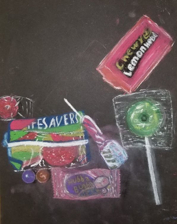
This is my drawing of a candy composition in pastel. I found this project extremely difficult to do and have learned that pastel does not agree with me. This project was focused on the opacity of the candy and the highlights of it, but I found this very difficult to do with chalk do to the fact that you can not blend them together without muddling them up. It was hard to keep the bright look of the pastels since I like to blend things to create value, and this posed a problem for me. Part of my drawings would start out looking very crisp, but then I would add to much to them and lose the bright look I wanted. Some parts came out ok, for instance the lifesaver gummi I think was not half bad since it retained its brightness of color. I think this project would have been easier for me If done with prismacolor since I could have retained color without losing it to muddiness.
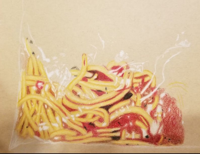
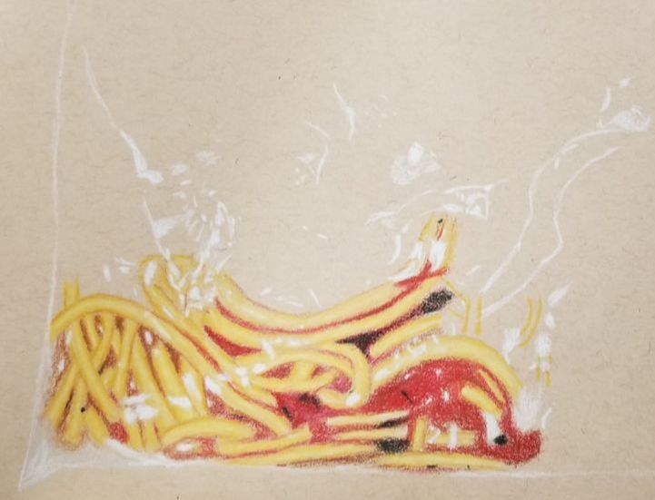
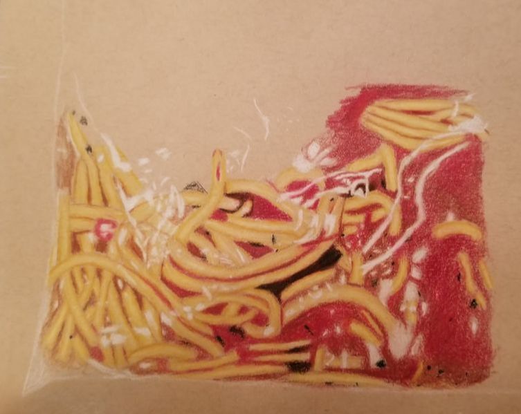
Here is my opacity sketch, I only ended up sketching out the highlights for it due to time constraints.
Here are my in progress photos of my opacity drawing.
|
|
Opacity critique questions:
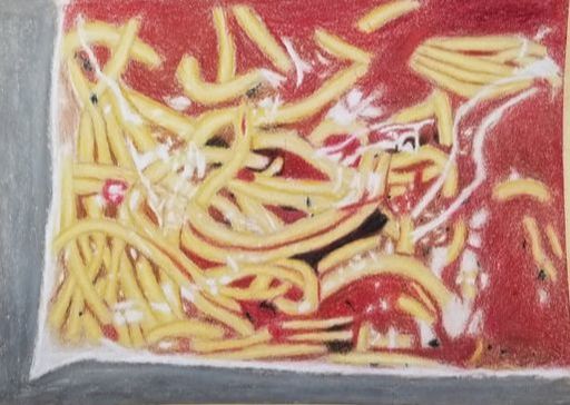
1. I think the noodles on my drawing are the neatest part of my drawing they have good value in them and shape without any over blending. I think the highlights were also done well and it can be clearly seen that they are the highlights on the bag. Other parts such as the sauce and background were not done as neatly and I think they could have been done a little better if not for the difficulty and frustration of my idea I choose. It was really hard to construct a realistic looking piece due to the fact that my drawing was of a bad of noodles, and this lead to me not having the best craftsmanship on my drawing.
2. I don't understand this question since I did not have three artworks?
3. I tried to use colors as close to my reference photo as possible, so I used cream colors, tans, blacks, and reds to create the shading and color of the noodles and sauce. I think the real colors of spaghetti with red sauce naturally is pleasing to look at, so I tried to stay as close to the real colors as possible. I think the colors came out quite well and the darkeness of them contrasted well with the highlights of the bag.
4. I used darks and lights to create contrast in my drawing alongside varying colors to create contrast in my drawing. I first put in the white highlights of the drawing to make sure there was a stark contrast between the bag and the noodles behind it. I think used dark browns on the edge of the noodles to create contrast between them so they were distinct of each other and the sauce they were drawn in. I also used brown in the red sauce to create contrast with the rest of the sauce, by making areas of the sauce darker the sauce had contrast and did not look as flat due to value.
5. The most important part of the drawing was the white highlights that made the drawing have opacity. These white highlights help gave my drawing a more realistic feel by adding depth to the drawing. I used black and dark brown to create shadows in my noodles in order to give it a realistic look, and I think that it enhanced the artwork by adding depth to it. I did not have to much texture in my drawing since noodles and sauce are not the most textured thing in the world, but I did try and add texture in the bag to give it a creased look.
6. I choose a grey for the background since I thought it would help contrast with the red and tans in the drawing. I think it was kind of a mistake to use grey since it ended up not really contrasting that well with the noodles and sauce. I think a color such as green or purple would have created more contrast due to them being on opposite sides of the color wheel from the tan and red colors.
7. It is extremely important for prismacolor drawings to work to have a mastery of how to properly blend them without losing distinct colors in your artwork. It is important to know where to put values, and how to plan out where you are going to place the lights and the darks on the piece of artwork, since you can not go back over colors without losing part of the shine of the prisma. knowing to never go over a lighter color with a darker was very important for this piece since for it to be successful I needed bright white highlights. Without previous practice blending with the prismacolor pencils this drawing could have gone drastically bad.
8. This whole drawing was difficult due to the nature of having to plan out every noodle and part of the sauce. This is mainly the attention to detail that made it so difficult to draw, I had to make sure each noodle was only a certain length, and that the sauce was in only certain places. Without the planning the noodles would have just looked like a complete mess. I could have improved this drawing by doing an outline of where each noodle was covered with sauce since I had to go over some of the noodles with red, and that created a muddy look to some parts of the drawing.
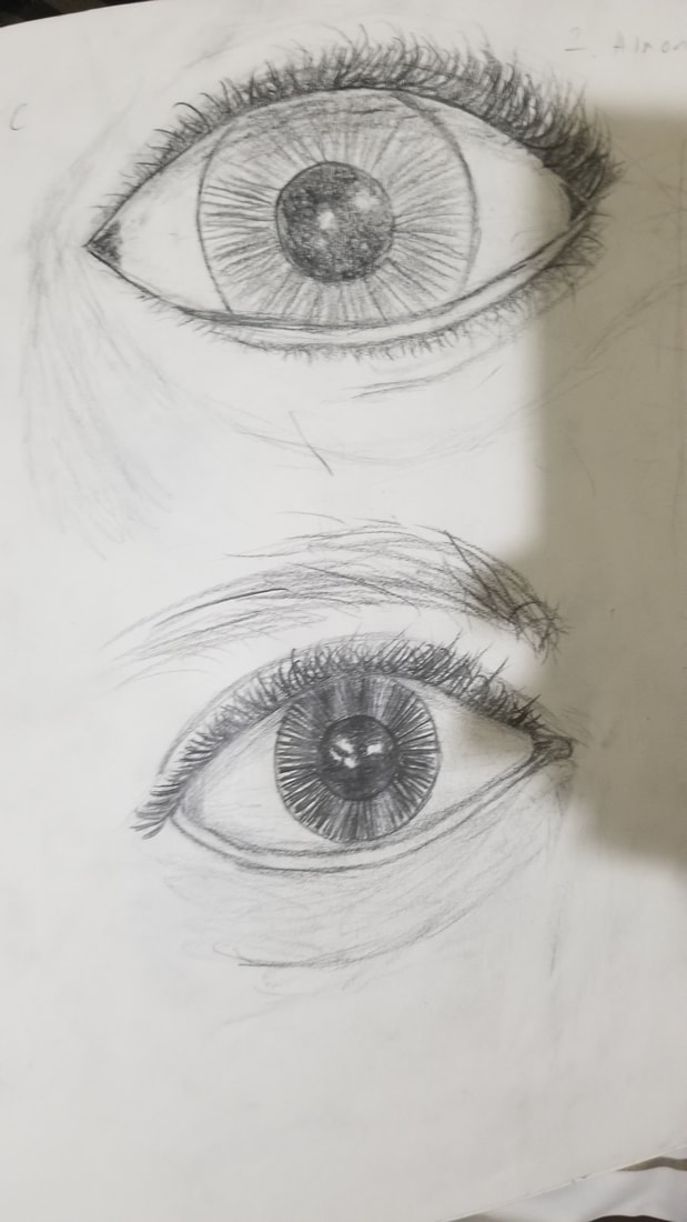
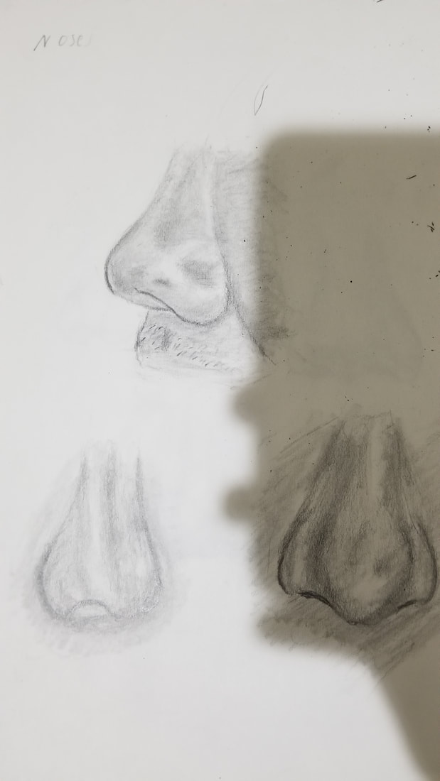
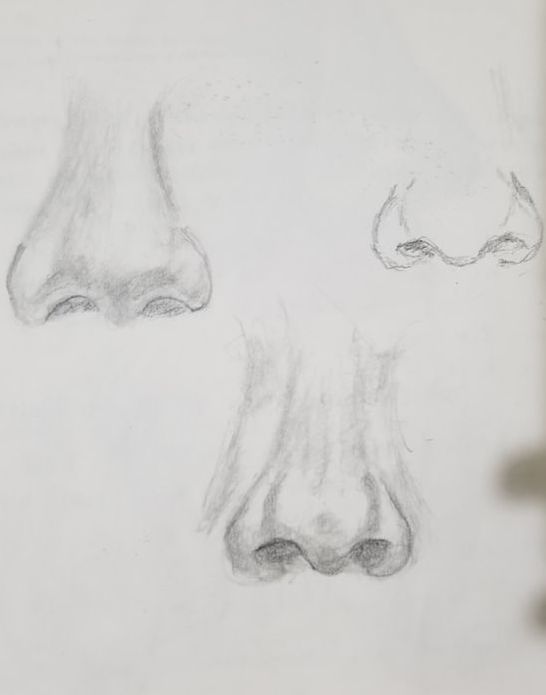
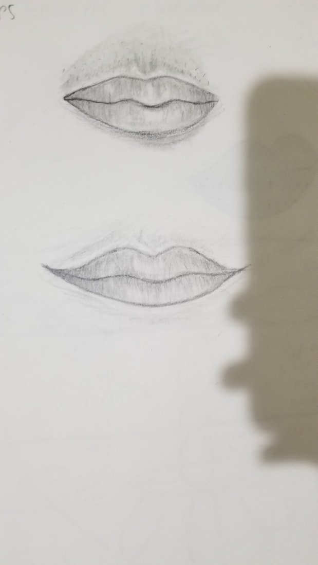
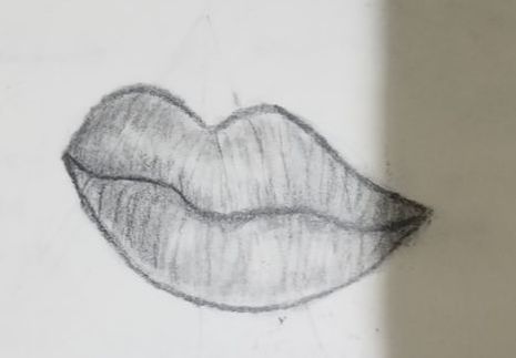
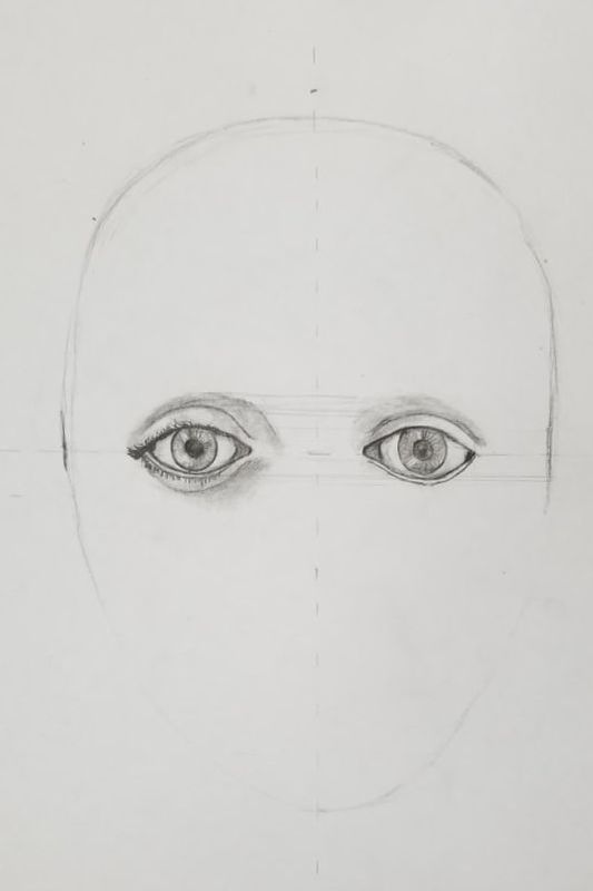
Here are my facial feature practice drawings. These practice drawings were important for the final portrait especially drawing them in different angles and lightings because you needed to understand how the facial features really looked to gain and understanding of how they mold into a face. Also drawing them more than once was very important since practice is very much so needed on facial features, especially since I have not had any previous experience drawing realistic facial features.
|
|
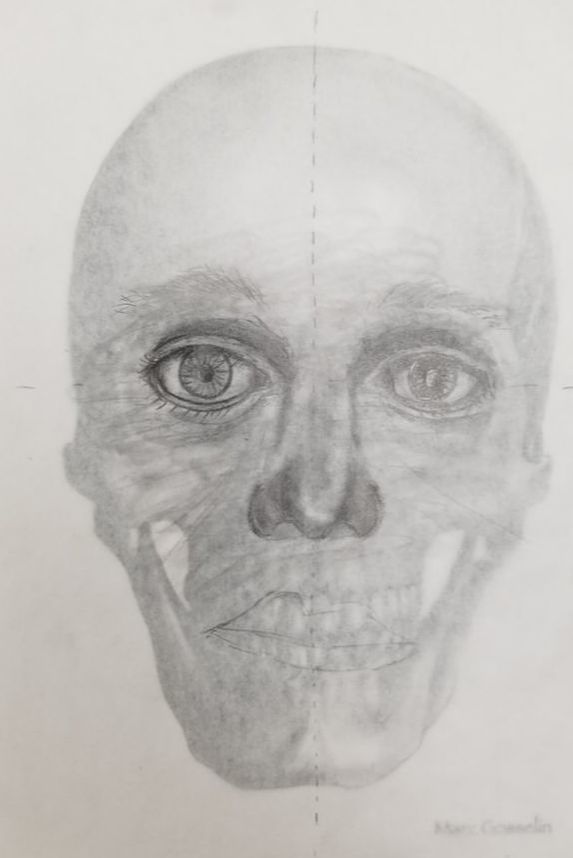
Here is my skull drawing. It was very useful to do a drawing over a skull to figure out how to create proper proportions for the portrait drawing. It was good practice also on how to align the facial features up in a symmetrical way. It would have been even more useful if I had time to have finished the whole drawing of the skull. The only issue with this practice is that peoples bone structure are different, so it was not a perfect practice for how to place facial features on a face. Overall what I had done on it was useful for my final drawing.
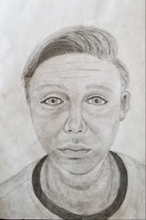
Here are in progress photos of my portrait drawing.
|
|
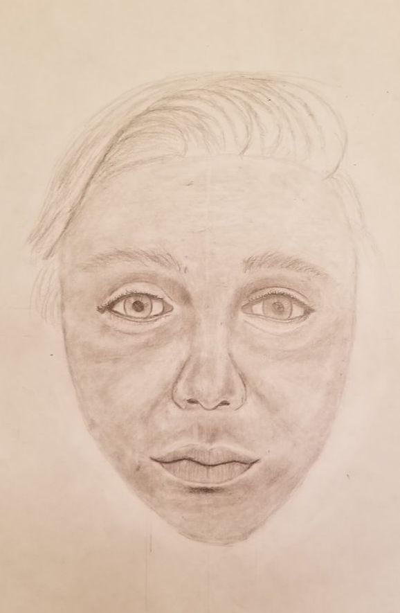
1. Explain the process you went through to develop your drawing. I started out my drawing by creating an egg like shape for the head and then put two lines down the vertical and horizontal middle of the egg shape. I then planned out the eyes first since I would use them to measure out where other facial features would be. Then I added in the nose to the drawing, after that was the lips for the main face facial features. I then blended the facial features into the face, and added cheeks into the painting. I finished up by redrawing the chin and jawline. the last parts I added were the hair and the neck of my portrait drawing.
2. Explain how you found the different values in the portrait? I used a reference photo to find different values in my drawing. I simply looked at where the dark and lights were on the photo to put value in my drawing. I did darken up some shadows such as the underbags of the eye more than they seemed in the photo in order to give my photo more depth to it.
3. Did you achieve a full range of the different values within your portrait? How? I think I had a mostly full range of values in my drawing since there is a large amount of mid values with bright highlights and dark shadows. You can see where my darkest shadows are in near the eyes wear the creases between the eye and nose are, and also in the hair where the darkest values are in. There are highlights on the cheeks of my drawing and to showcase they are elevated above the rest of the face.
4. Describe your craftsmanship. Is the artwork executed and crafted neatly? I think it was executed fairly well, and I spent a lot of time making sure it was blended without distinct pencil lines. The eyes of my drawing are fairly close to how they actually look, and I spent a lot of time making sure they had the correct shape and to make the circular parts of the eyes as close to a perfect circle as I could. I think the neck could have been drawn a little better that and the ear of my painting were a bit less well blended as I would have liked.
5. How were you able to capture your look? I captured my look by trying to as closely follow the reference photo I took as possible. I tried to make my features such as my eyes and hair to look as similar to as they actually are in real life. I think the drawing ended up making me look a bit older and sadder than how I look in real life. Overall I think it fairly looks like myself.
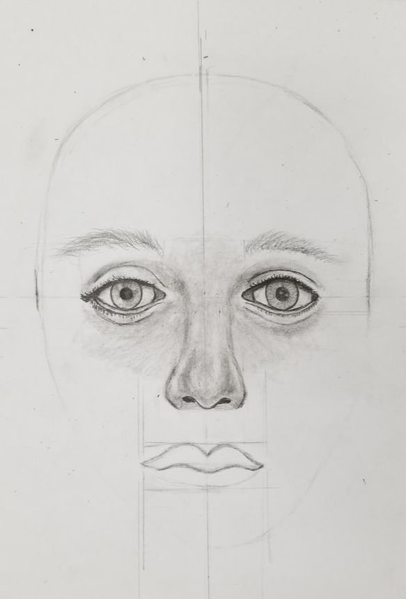
6. Explain how you made sure you had correct facial feature placement. I first drew my eyes then I used a ruler to measure them as a tool for where to place the other features on my face. I looked at the reference photo and also used the planning guide you had given us to correctly place the facial features off of eye length from the eyes and other facial features.
7. Explain the importance of learning how to draw all the features individually. It was very important to learn how to correctly draw each facial feature beforehand since the drawing would have been terribly otherwise. Having practice on the facial features was great since it made it much easier to draw them on my final drawing. It also helped since the facial features were not all different shapes and had a good overall proportion
8. What part of this unit was the most beneficial and why? Learning where to correctly place the facial features through the usage of eyes as a measuring tool, and the skull drawing were the most beneficial things to do in this drawing. This is since having correct proportions is very important on a portrait or else it will just end up looking off in a way.
9. List any obstacles you had to overcome and how you dealt with them. It was very difficult to get my eyes the right shape in the drawing, and I ended up making them bigger than they really are. This caused me to have to erase the eyelids and pull them up of my eyes to get them closer to the real shape, which was difficult since I did not want to have to completely redraw my eyes. I also had difficulty with the hair since my hair is straight it was hard to put in values without making my hair look like it was just a bunch of big clumps. I had to slowly put in different areas of value to make my hair look right.
2. Explain how you found the different values in the portrait? I used a reference photo to find different values in my drawing. I simply looked at where the dark and lights were on the photo to put value in my drawing. I did darken up some shadows such as the underbags of the eye more than they seemed in the photo in order to give my photo more depth to it.
3. Did you achieve a full range of the different values within your portrait? How? I think I had a mostly full range of values in my drawing since there is a large amount of mid values with bright highlights and dark shadows. You can see where my darkest shadows are in near the eyes wear the creases between the eye and nose are, and also in the hair where the darkest values are in. There are highlights on the cheeks of my drawing and to showcase they are elevated above the rest of the face.
4. Describe your craftsmanship. Is the artwork executed and crafted neatly? I think it was executed fairly well, and I spent a lot of time making sure it was blended without distinct pencil lines. The eyes of my drawing are fairly close to how they actually look, and I spent a lot of time making sure they had the correct shape and to make the circular parts of the eyes as close to a perfect circle as I could. I think the neck could have been drawn a little better that and the ear of my painting were a bit less well blended as I would have liked.
5. How were you able to capture your look? I captured my look by trying to as closely follow the reference photo I took as possible. I tried to make my features such as my eyes and hair to look as similar to as they actually are in real life. I think the drawing ended up making me look a bit older and sadder than how I look in real life. Overall I think it fairly looks like myself.
6. Explain how you made sure you had correct facial feature placement. I first drew my eyes then I used a ruler to measure them as a tool for where to place the other features on my face. I looked at the reference photo and also used the planning guide you had given us to correctly place the facial features off of eye length from the eyes and other facial features.
7. Explain the importance of learning how to draw all the features individually. It was very important to learn how to correctly draw each facial feature beforehand since the drawing would have been terribly otherwise. Having practice on the facial features was great since it made it much easier to draw them on my final drawing. It also helped since the facial features were not all different shapes and had a good overall proportion
8. What part of this unit was the most beneficial and why? Learning where to correctly place the facial features through the usage of eyes as a measuring tool, and the skull drawing were the most beneficial things to do in this drawing. This is since having correct proportions is very important on a portrait or else it will just end up looking off in a way.
9. List any obstacles you had to overcome and how you dealt with them. It was very difficult to get my eyes the right shape in the drawing, and I ended up making them bigger than they really are. This caused me to have to erase the eyelids and pull them up of my eyes to get them closer to the real shape, which was difficult since I did not want to have to completely redraw my eyes. I also had difficulty with the hair since my hair is straight it was hard to put in values without making my hair look like it was just a bunch of big clumps. I had to slowly put in different areas of value to make my hair look right.
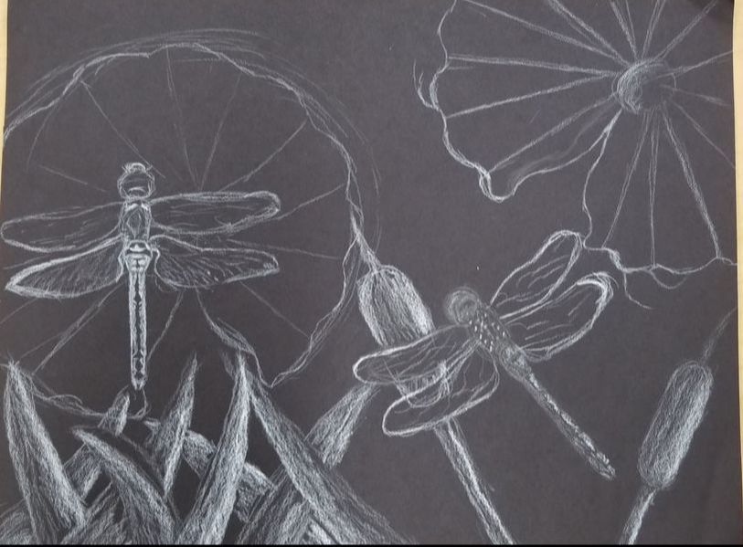
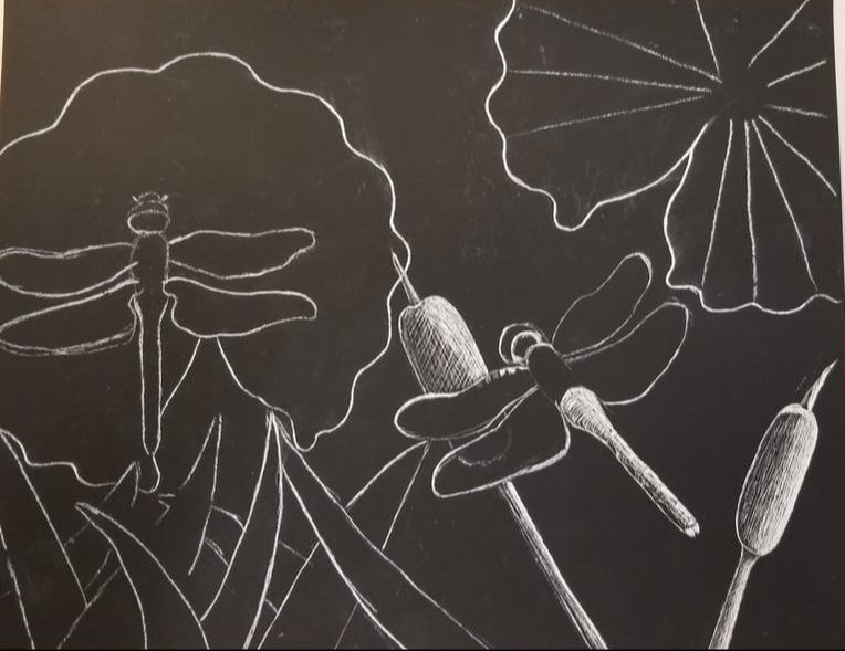
Here is my rough draft for the scratch board alongside in progress photos
|
|
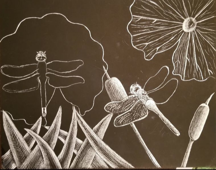
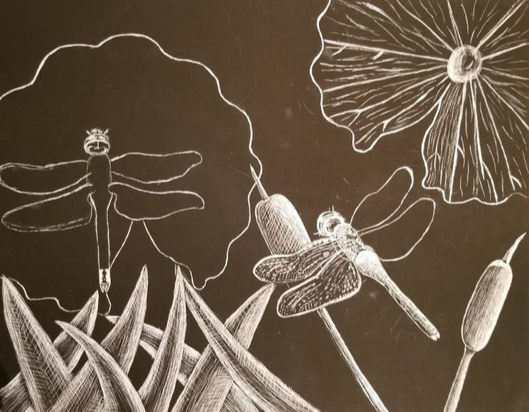
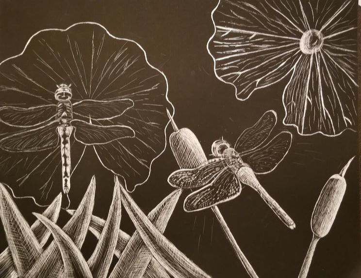
2. How did you use textures to enhance your picture? I tried to add texture in the cat tails and grass of my art piece by adding in cross hatching to give it shading and texture. I also added texture in the lily pads to give it the look of the veins.
3. How did you balance your artwork and create a well-organized composition? I used a lot of negative space in my piece to give the look of the water in the pond and left most of the background very light. I left the objects in the art piece very bright to contrast with the black.
4. How did you imply movement in your drawing? I used grass and cat tails alongside the dragonflies to create movement in my drawing. I tried to make the grass and bob tails to look like they were swaying in the wind to add movement into my drawing. I added marks near the dragonflies to make it seem like they were bushing the air around with their wings. I also positioned them in a way with their wings to seem like they are flying.
5. How could you improve your artwork? The main downfall of my painting is the fact that I could not erase with the scratchboard since my art piece ended up looking a bit messy due to that fact. I could have a lot more detail in the art piece if I knew how to use scratch board better. I also could have had straighter lines in my art piece, but the scratch board was difficult to work with. Due to the unevenness of the scratch board it looks a bit more like a sketch than I would like.
6. How did you demonstrate a wide range of shading values?
I used mainly cross hatching to creating a range of values in my art work. I simply left the black as the darks of the painting and scratched in where I wanted it to be lighter. I think I did this well on the bobtails since they seem to have a good range of value in them due to cross hatching.
- Describe the subject matter and meaning of your artwork. The subject matter is dragonflies flying over a pond with flora you would expect to find in a pond. I would not say there is really much in regard to meaning of my art work. It could be said that the pond scene conveys a calm mood for the viewer, but it’s not really that deep.
2. How did you use textures to enhance your picture? I tried to add texture in the cat tails and grass of my art piece by adding in cross hatching to give it shading and texture. I also added texture in the lily pads to give it the look of the veins.
3. How did you balance your artwork and create a well-organized composition? I used a lot of negative space in my piece to give the look of the water in the pond and left most of the background very light. I left the objects in the art piece very bright to contrast with the black.
4. How did you imply movement in your drawing? I used grass and cat tails alongside the dragonflies to create movement in my drawing. I tried to make the grass and bob tails to look like they were swaying in the wind to add movement into my drawing. I added marks near the dragonflies to make it seem like they were bushing the air around with their wings. I also positioned them in a way with their wings to seem like they are flying.
5. How could you improve your artwork? The main downfall of my painting is the fact that I could not erase with the scratchboard since my art piece ended up looking a bit messy due to that fact. I could have a lot more detail in the art piece if I knew how to use scratch board better. I also could have had straighter lines in my art piece, but the scratch board was difficult to work with. Due to the unevenness of the scratch board it looks a bit more like a sketch than I would like.
6. How did you demonstrate a wide range of shading values?
I used mainly cross hatching to creating a range of values in my art work. I simply left the black as the darks of the painting and scratched in where I wanted it to be lighter. I think I did this well on the bobtails since they seem to have a good range of value in them due to cross hatching.
Overall I think this was the most important class i have taken so far for art. Drawing is the very basics of all artwork even with paint and other mediums. It was very important to learn proper line to create artwork that looks very neat and technical. Learning contour line as the first thing was a very good introduction to how to properly draw. It was good to learn it to show the form of objects through line. Reviewing value was also very important for the class in order to create proper shading in my artwork it was great practice to do forms and other practice drawings for value. There was a plethora of very important things that I have learned in this class to improve as an artist. Overall it was enjoyable class, and was worth all the work that we had to do in the class. I do think this should be the first class taught since drawing is the building block of all almost all artwork.
