I can't really believe this is my last art class after taking six over my highschool career, and I feel very bittersweet over ending it all. I have learned so much from my previous classes, and I could see how I was making real progress in my work. I also discovered a passion for art I did not know I had, and I got to express myself through this medium. I am ever grateful to my art teachers especially you Mrs. Rossi for showing me how to find a passion for things, since I spent so much time just goofing off and never really trying. I feel like I really tired at art this year, and Independent studies is where I got to put what I learned to create my own unique pieces that I came up with. The two pieces I finished in this class are my favorite pieces of art that I have done in my life, since I had to fully come up with my own idea of a piece. This class helped teach me how to create an image in my mind for a piece, and then how to get that image down onto a canvas. It really made me have to try my best in creating an original piece of art to reflect something inside of myself. I won't ever forget the patience that art has taught me to harness over the course of these art classes, to make me calm down and just really focus no matter how hard it was in the moment. I hope to go on continuing to do more and more art in the future when I have the free time, and I will keep working on my oil painting that I learned to love this year. Once agian thank you for allowing me the opportunity to take this class and allow me to further myself as an artist. I won't forget all that I have been taught, and I hope you enjoyed seeing my art improve as I did.
|
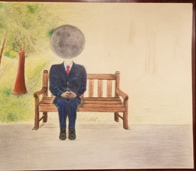
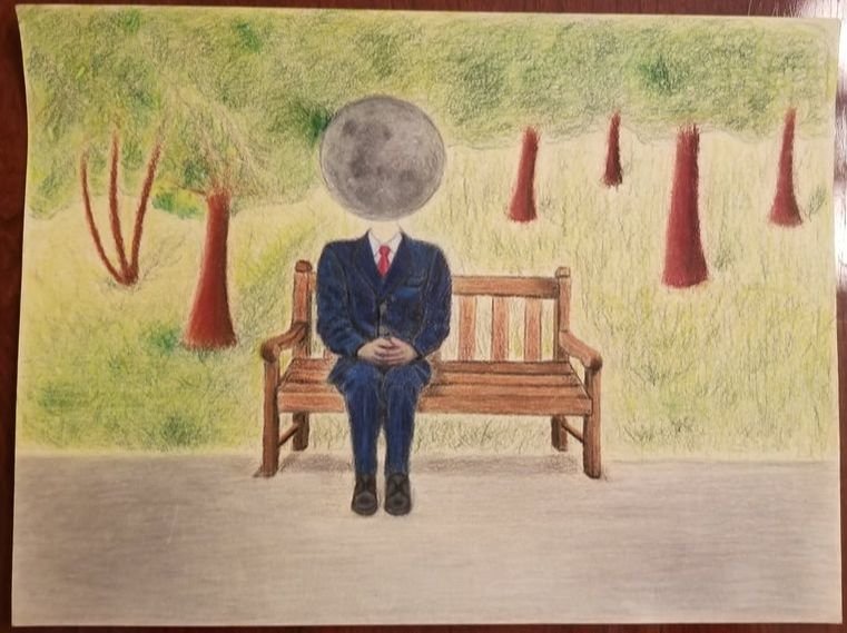
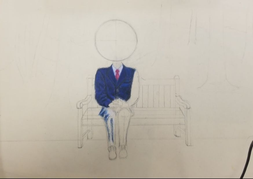
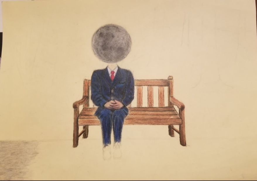
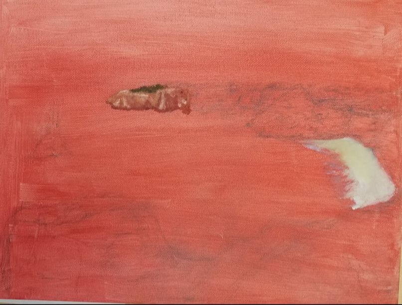
This is my unfinished piece of a desert setting with a cat god as a sun to create a silly feel for the painting. This piece is where I started to lose steam for art, and was feeling pretty arted out by the time I started this piece. I really like the idea of a cat god with cats worshiping it, but lost my ability to really work on this piece and get it somewhere I wanted it to be. I like the whole lay out of the piece especially the composition with the cat god in the corner, pyramids on the horizon, and the cat that is staring into the cat god. I think the colors were starting out nice on the pyramids, but I just started getting frustrated with the whole painting since it was not looking how I wanted it to look. I hope to finish this painting over the summer though, and post it here. 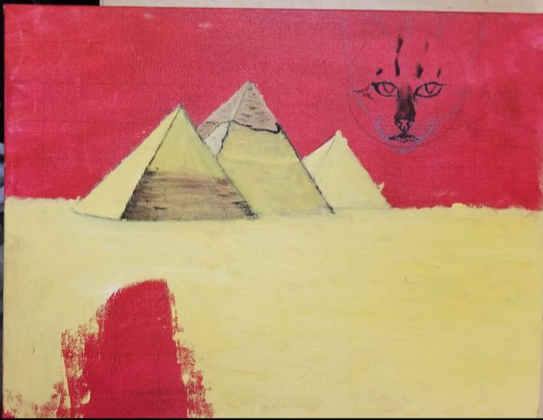 This project was done in prismacolor in the style of surreal art, and has ended up as one of my favorite pieces I have made so far. I think it has a great amount of detail in some areas, but lacking in detail in others. I was proud of my technique on the suit and moon of the man, I think my blending was done quite well on them. I tried to add as many layers of colors to create a more realistic look in this piece. I think these layers can be seen in the moon, how it has many different shades of grey to look marred such as the moon actually does. I used the ruler a lot to try and get exact proportions on things such as the bench, and to make sure that I got the perspective right on it also. The piece has a very interesting feel to it in my opinion due to the contrast of the bright park setting, and the night time feature of the moon as the man's head. I have a couple issues with this piece though that I would like to clean up. Mainly I think that the trees and grass just need some more layers in them to get them to where I want, and I hope to work on those parts over the summer. I also really disliked the hands on the man, I just was so confused on how to draw realistic hands making them appear to be very flat. Overall though I really enjoyed this project even though it like the last one took a crazy amount of time to finish, but it was worth it to me to spend that much time on just one piece. I enjoyed doing something that was outside of the box and felt unique to undertake as a project
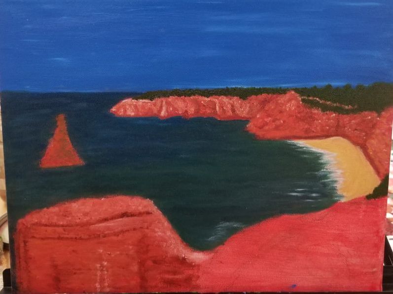
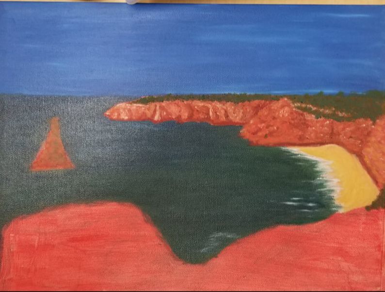
  Here is my inprogress landscape painting that I started on during the beginning of the quarter. I wanted to combine the colors a desert canyon, with the landscape of an ocean cliff side. I found a couple reference photos of an ocean landscape alongside reference photos of some orange desert landscapes. I added in some elements of a desert landscape such as desert rock spires and cliffs that I had found into the foreground of the landscape. I used a variation of yellows, reds, and oranges to create the dusty look desert rocks that I had found in my reference photos. The colors came out quite nicely especially in the area that is near the horizon line of the landscape, and I also quite like the deep greenish blue I used for the ocean. The light oranges contrasted nicely with the look of the ocean. I also used a very deep blue in the sky to give the picture more of a feel of the ocean meeting the desert, for in the photos of the desert the sky was a very deep and dark blue versus the ocean photos which had very light blues. This was a very detail oriented painting for me especially in the value changes of the rocks, I wanted the rocks to look very realistic, so I tired and get down the shadows of the rocks to create a realistic contrast in my painting. This painting has quite a way to go still, and I hope to return to it next quarter. It has been a very promising landscape so far, and I think my craftsmanship is apparent in the small details, usage of color for contrast, and composition of the piece.The last photo is not the most recent one, since I forgot to take a photo at school, but it gives a good idea on how the piece looks.
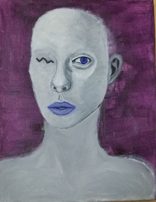
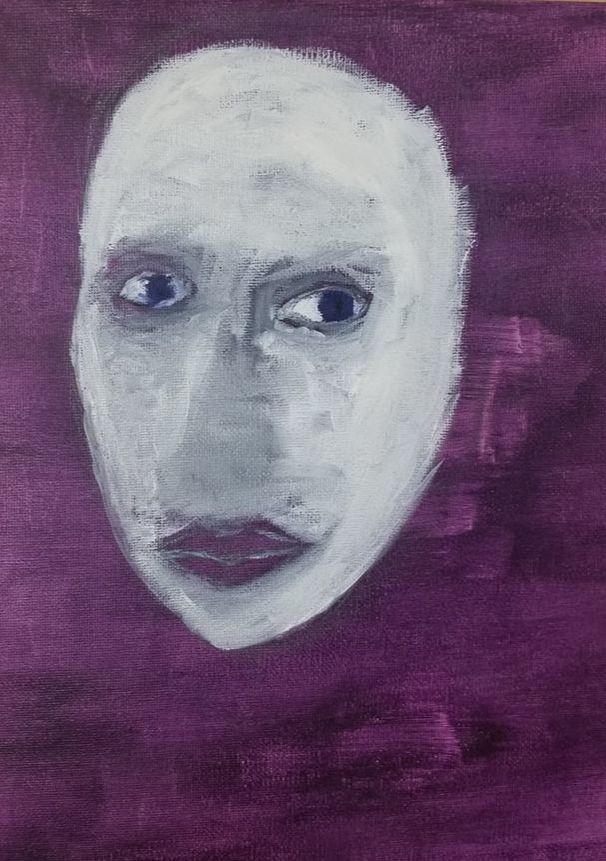
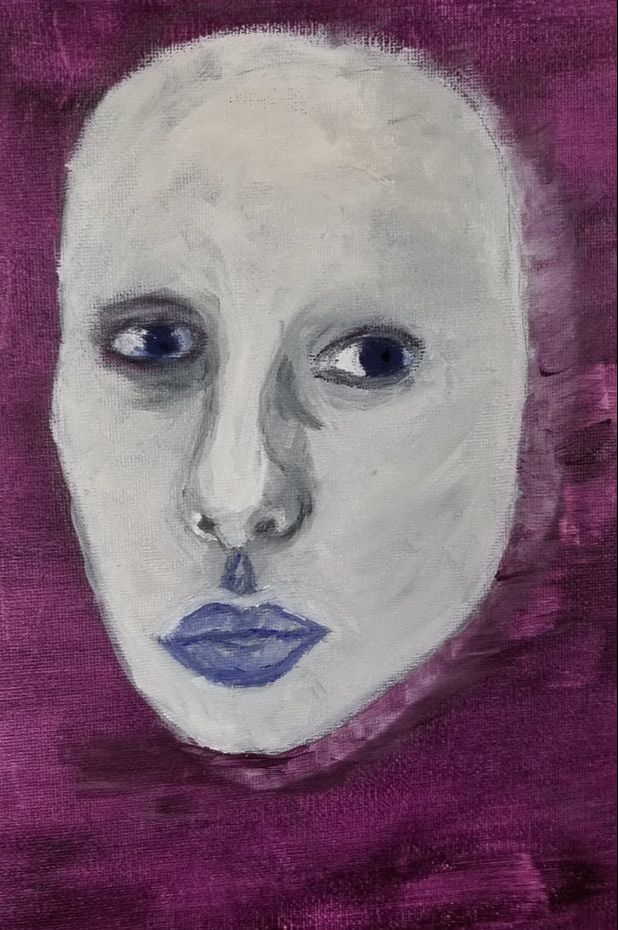
 This is the water color project we did with the guest artist using masking tape, yellow, blue, and red paint mixed with lots of water in droppers for the project. It was most certainly a novel way to create a painting by using the masking tape to protect values in the piece, but I did not enjoy the lack of control. It created a more abstract painting due to the lack of control on color, and general abstractness due to there being no distinct lines only really value change. I can not say I would ever do this method agian, since it is not really my style, and I did not really like how my piece came out. The colors were very muddled, and while that's what the artist wanted a variation of grey's that's not my cup of tea. I think I would like to redo my subject matter of the sea slug since it is a beautiful animal, but with a normal method that I have more control over. I did however enjoy how the background looked with the swirl of colors, I thought the abstractness of it was quite interesting. 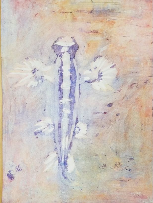 This is my surreal portrait that was originally was going to be in the vein of a lady who looked to be made from china. I used white, grey, and blue to give this look of a lady made from china, but it ended up going in a slightly different direction. The subject became more similar to an alien rather than a lady made from china, and I was perfectly fine with this new direction. It became a very spooky painting that reminded me of an alien from star trek. I am glad that the painting is still quite surreal in the way it looks especially with the usage of blue for the eyes and hair. It started out quite horribly, and I almost lost all hope in my ability to create a quality surreal portrait. I am glad I stuck with it by focusing on small sections of the portrait to slow down, and get a more realistic look in my painting. As seen in my in-progress photos the painting underwent quite the transformation from utterly horrible to quite adequate. I had a lot of trouble with this project especially with stopping myself from redoing areas such as the nose, that I repainted around 3 times. I would get very frustrated and ruin parts then have to calm down, and redo them since my expectations were lower. I think the best part of my craftsmanship was usage of value in the face especially In the eye and nose to create a smooth look that shows little of my brushstrokes. I am really happy with how the majority of the painting turned out, and like the direction it went in. I would like to go back and add more details such as a pattern you may see on a piece of china, and also fix areas such as the shoulders and the eyelashes. The best part of the painting in my opinion is my usage of color, since I only used 3 colors it created a very surreal look, for the subject has all human features along side an opaque color scheme that gives the painting a less human like feel. I especially liked the usage of the blue I made from ultramarine and magenta, the dark color added greatly to the surreal look by having a great contrast with the skin color. The contrast was very stark due to the unnatural color choices for the skin and hair that lead to the subject looking even more alien.
  |
AuthorWrite something about yourself. No need to be fancy, just an overview. ArchivesCategories |
 RSS Feed
