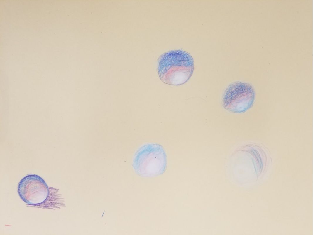
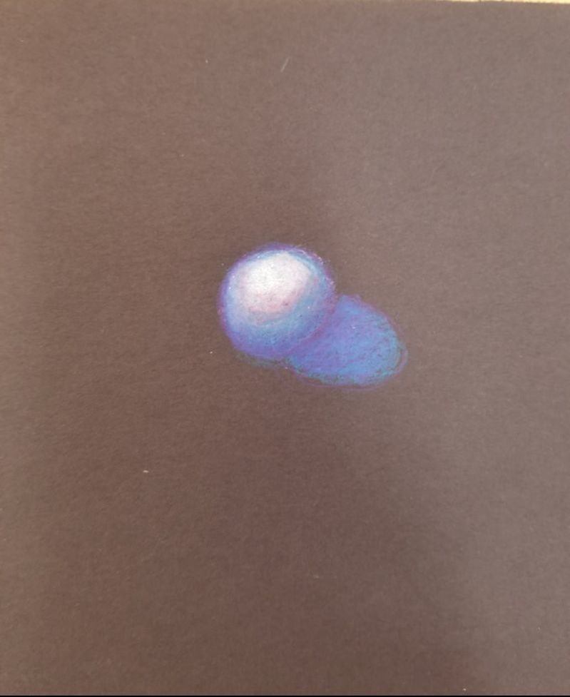
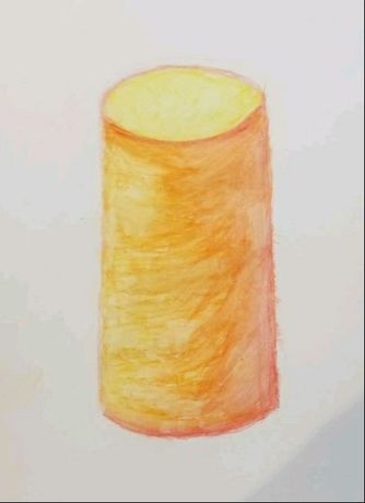
Here are my practice prisma color forms.
|
|
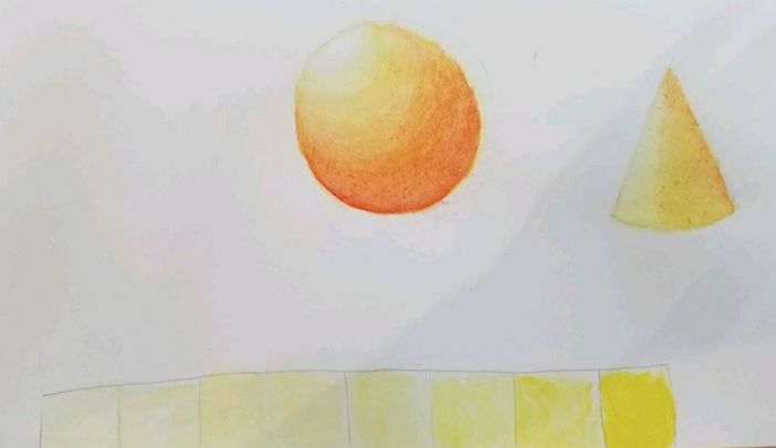
Here are my watercolor forms and value chart
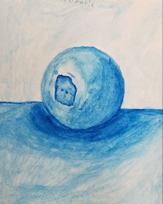
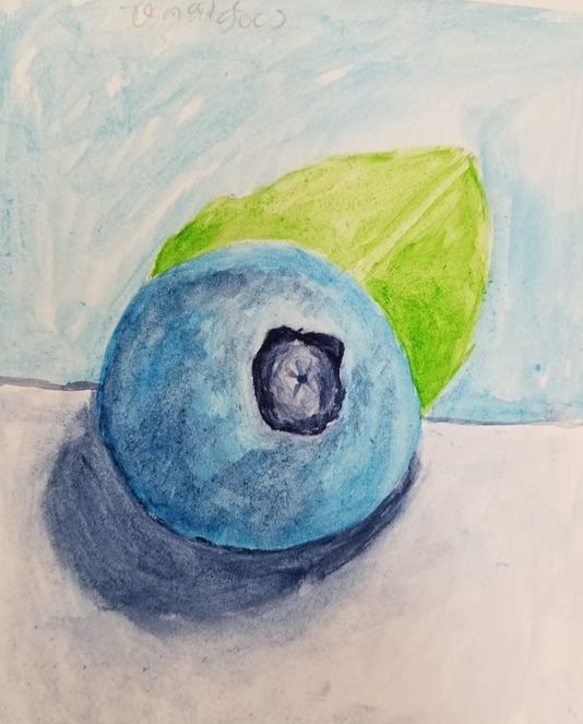
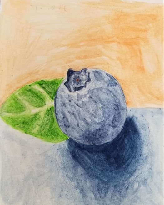
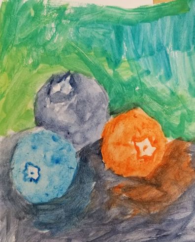
Here are my four paintings of blueberries, in order of monochromatic, analogous, triadic, and complementary. I think what this taught me was the usage of color to create a color scheme that caused the colors to pop creating a more 3d object, which I think my triadic blueberry shows. Using a very light wash to start helped immensely with building up the layers of color and to give value to my blueberries. It was good practice to do these blueberry paintings in order to get a better feel for water color especially with the different color schemes that you had us do. It was also good practice in the leaves to try the dry on dry technique of water color.
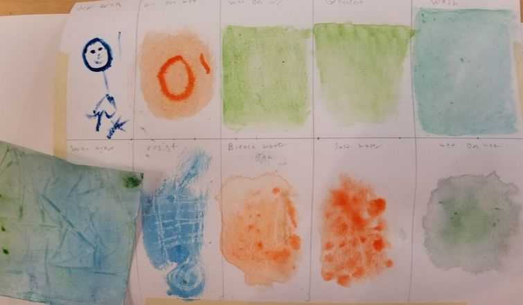
Here are my watercolor techniques. It was useful to have a lesson that helped relearn the techniques that I learned in Art 2 on water color. I ended up using wet on wet in my final painting so it was good to practice that technique and the other techniques.
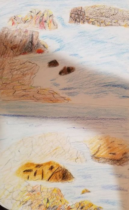
Here are my two compositional sketches for my watercolor
Here is an in progress photo of my final painting, I forgot to take them so I only have one that I took close to the end of my painting.
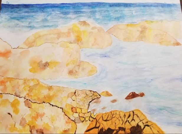
This is my water color final painting.
1. What watercolor techniques proved to be effective in your painting? How and Why? The main techniques i used were wet on wet, dry on wet, and dry on dry. For the rocks in my painting i mainly used wet on wet to give the rocks a multi color scheme with a splotchy texture, which i thought came out nicely in a strange flow style that compliments water color as a medium. To create the different colors and white space in the water i used mixture of dry on dry and dry on wet in order to show the range of colors that were in the water. I would go back with light washes of blue in the water to blend colors together in order to make the water look more fluid which was wet on dry.
2. How important was using transparent layers in your painting?
It was very important since I had rocks in painting I needed to use many layers of varying levels of darkness and transparencies in order to give my painting a 3d look. The contrast between my light and dark washes gave the rocks depth.
3. Explain how your composition was successful? Did you utilize all the elements of art and principles of design? Explain.
I believe my composition was good in the choice of colors used, proportions of the landscape, and the usage of value. I thought the blending of browns, tans, and orange was a good choice for the rocks in my painting due to the blending of the colors. I think the proportions of the ocean to the rocks was done well, it gives the painting a look as if it is a very large scene that is being viewed. I tried to make the back drop of the ocean to look as realistic as possible to as if someone was looking out to see. I also think I used value well in this project since there is an obvious distinction between the water behind the rocks and the water flowing around them.
4. Was color choice an important factor in the overall success of the painting? Why?
I believe it was a very important factor since water color has a very light look to it with not many strong distinct features it was important to use colors that complemented each other and made each other pop out. This is seen through the blues and greens that I used in the ocean I wanted the colors to be light but spots of much darker color to give the look of a churning ocean
5. Describe your craftsmanship.
I think my craftsmanship was probably the most lacking in this project I let areas of the painting get far to messy since I did not have a complete idea on how to control water color from spreading out onto the wrong colors. This can be seen in the edges of the rock which have some overlap of blue and brown that I did not want. I do believe that my placement and choice of color were done well though and that the shapes of the rocks were crafted well.
6. If you were able to do something different what would it be and why?
I would redo the bottom of the painting and have added in green to make it look as if grass was growing on the shore line, and I also had to cut off that part since I really messed up the rocks at first. It would have been nice to have kept that part of the painting, and I believe that a dark green in the rocks for the grass would have been a nice touch of color that would have stuck out and created detail for the rocks since I thought they needed more detail.
7. Explain to me what you have learned about watercolor and how it has improved or discouraged your development in art.
This painting has only improved my art development, since water color very much teaches the usage of improvising and letting paint do the work for you by letting colors mix freely. It was nice to do a water color painting since I did not have to worry about fine details, but focus on the design and usage of colors in a painting. This was very helpful for me since fine details normally psyche me out of painting since I normally end up disliking my work and feel like I cant make something look the way I want it to.
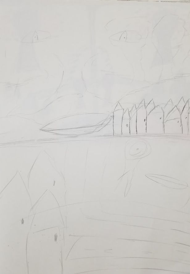
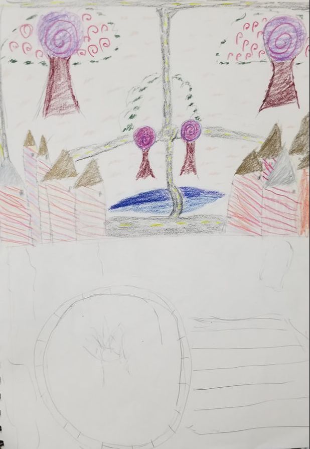
Here are my four compositional sketches that I made in order to figure out which design I wanted to go with for my final piece for the Hundertwasser painting. I ended up scratching most of the ideas, and had to revise my ideas in order to make it look better. I ended up using the idea you gave me for how to fix my painting.
|
|
|
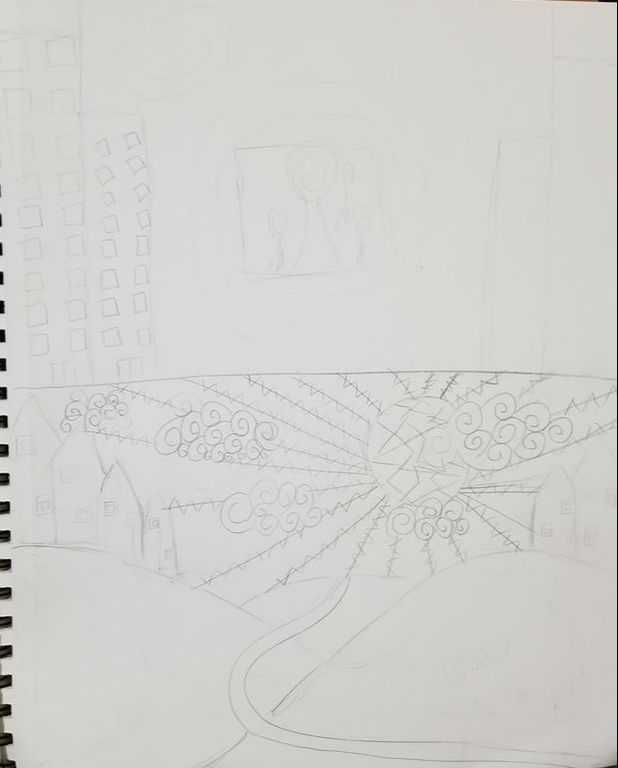
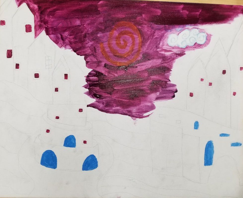
Here are two in progress photos of my painting. You can see from the first one how much of a drastic change my painting ended up going through. I had to pretty much scrap 90 percent of my painting, and went with a completely different design for it. I am glad I decided to redo the painting in a manner that ended up looking a lot better.
|
|
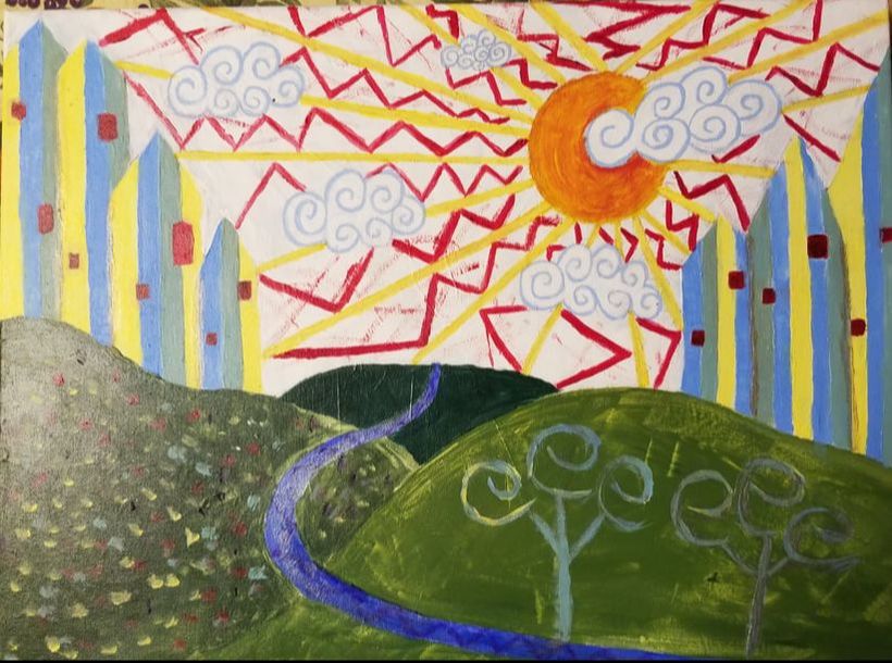
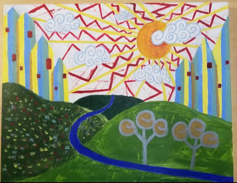
Here is my final picture on my painting
Hundertwasser painting critique questions:
1. The craftsmanship of my piece is a bit lacking due to me running out of time, redoing parts of my painting, and also just not being the best at using acrylic paint. Some of the lines of my painting come out really nice while others looked a tad sloppy. I really like the sky that I did, I feel like it turned out really good with the clouds, sun, and sun rays all looking nice. I also liked the houses I did since I tired to make the colors of them to be very even lines, and I think they came out well and fairly even. I think the main thing my painting lacks is paint on the canvas, and i feel like the hills and the whiteness of the sky needed more layers in order to look neater.
2. I used elements of hundertwasser's usage of repeating patterns, organic buildings, and nature and human made objects together. I think the odd and non symmetric shapes of the houses alongside their repeating color scheme fit the theme of hundertwasser's work. I used repeating patterns in the clouds, and the patterns in the sun rays in order to make the sky fit the theme of using patterns. I also did not draw anything in correct perspective to give the painting the 2d look that hundertwasser used in his paintings
3. I used pastel colors on the buildings and dull greens on the hills alongside a deep blue for the stream to create contrast between these objects. I feel like these colors really stand out from each other in a nice way that is contrasting without clashing in color. I think the best color scheme is in the sky since the lightblue clouds alongside the vibrant colors of the sun rays really pulls the eye the sky especially the clouds. The dark red and vibrant yellow and orange h. elp to push the clouds to the forefront of the sky. I think overall the colors work well together without clashing.
4. The focus point is sun and the cloud in front of the sun. The placement of the sun to the top right draws the eye towards it and the cloud especially with the white background and placement over the buildings. The sun rays also draw your eye up to the cloud since your eye follows the lines up to it. Overall the sky is what I want as the focus point of the whole painting.
5. I used patterns mainly in the sky since I wanted the sky to be the focus and very patterned. I think the spiral clouds ended up being a really nice touch due to the pattern I did in them and how they contrast from the pattern between the zigzag pattern between the sun rays. I also used patterning in the buildings by repeating the same colors throughout them in order to create an interesting pattern that in a way makes them seem to flow together. I tried to add a pattern into one of the hills in order to create the look of flowers, but I don't feel like it came out very well.
6. I did not put a border on my painting due to me feeling like it would not have added to the design I did.
7. The biggest problem I had was layering the paint over the canvas without going into the other colors of paint which ended up happening a lot to me sadly. It was just really difficult for me to make neat orderly lines especially on the houses which were really hard for me to do. My paint ended up getting onto other lines which made it look messy in some areas especially with the sun rays which were hard to make uniform and one hue. I also faced a problem early on with the design of my painting due to me really disliking how it looked, and then scrapping the whole idea and creating a whole knew design leaving only the houses. I think acrylic is just not a medium that agrees with me due to how thin the paint is and the quickness of drying since that forces you to create a lot of colors before applying them. It is much easier for me to blend as I go rather than make my own colors.
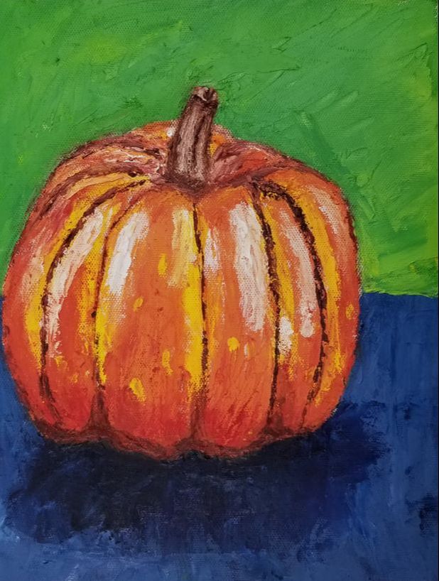
Here is my palette knife painting of a pumpkin. The palette knife was a good introduction to oil painting and I could tell right away how much more i prefered oil as a medium. The pumpkin was good practice for learning how to plan out a painting by putting down the colors I needed before I add a whole layer of color to the whole canvas. The palette knife was also good since it was such a different tool to use compared to brushes, and I had to learn techniques like using the side of it to create lines to give my pumpkin details I thought not possible with a palette knife. It was also interesting to learn how to use texture of oil to give your painting a more realistic look of it. You could use very thick layers of paint to create the texture of things like the stem in a way not possible with other mediums since it literally was raised up off the canvas.
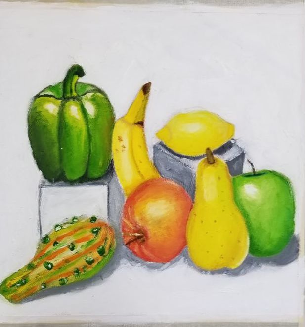
Here is my oil painting of a fruit still life. This is my favorite thing I have painted so far, and I am still really enjoying using oil as a medium since I feel like I understand it far more. This project was quite challenging in some ways especially with learning how to blend the oil together without muddying it up. I feel like parts of my painting were far more successful than others, but I overall really like it. The pear was one of the most informative parts of the painting for me, since the pear appeared to the naked eye to be quite lacking in value I had to really think about what colors I could add to subtly show the value. It taught me a lot about how colors work when blended together, for instance I blended out green and brown into the pear without losing a distinction of color or making the transition look abrupt. I really liked learning how to blend colors on top of each other, and I would use white in many areas in order to create transitions and highlights that I really liked the look of. I really struggled on the gourd though since I just found it very difficult to recreate the texture of it due to its odd shape. I tried my best to put on thick layers of paint to create the bumpy texture of it, but I feel like it is the most lacking part of the painting. I think this was a great project for oil since all the objects were varying in shape and color, and it was also fun to paint while being great practice.
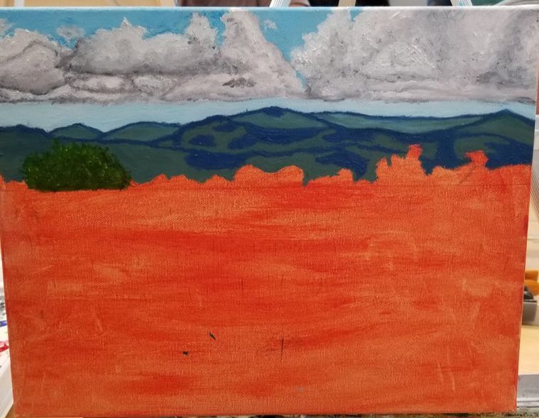
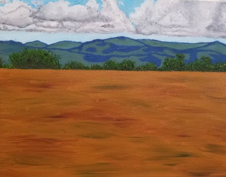
Here is my in-progress photos of my landscape painting
|
|
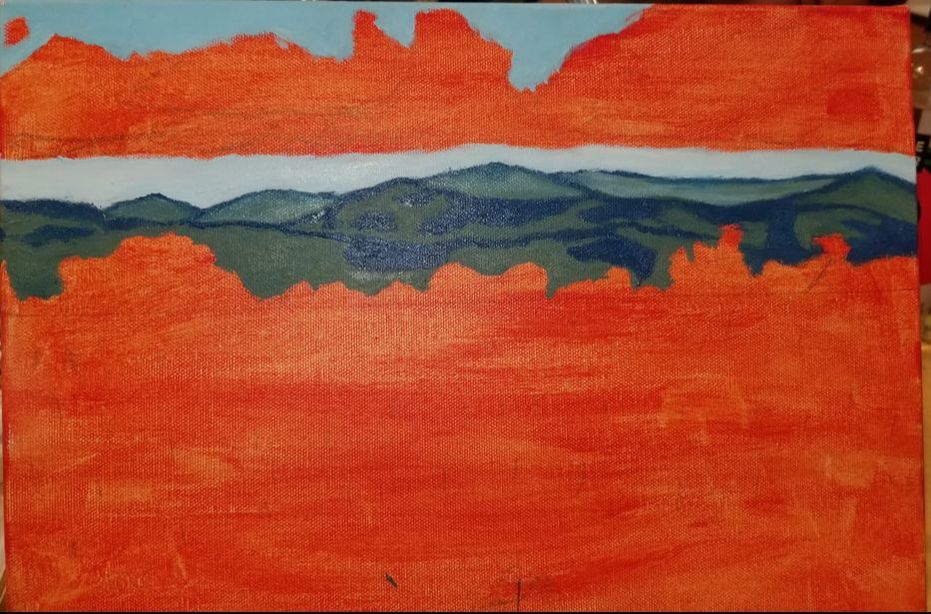
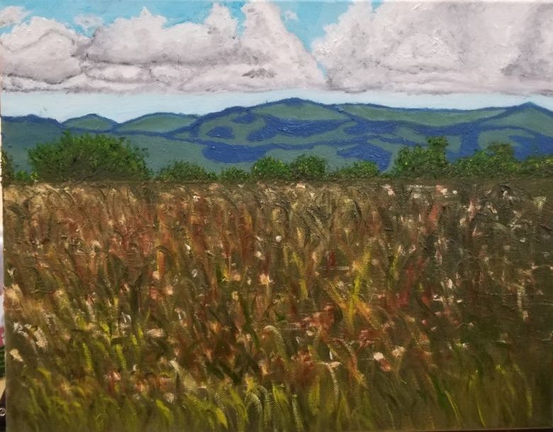
- Describe the craftsmanship of your painting. (Is it neat and well executed?) I think the top half of my painting is well executed and done quite neatly. I spent a lot of time on the bushes and clouds in the top half, and I think that shows in my painting. I have clear lines to separate the clouds and bushes from the rest of the painting, they seem to me to be slight realistic in look. The bottom part of my painting is not as neat as the top half, and I had a lot of trouble with the grass in the foreground. Some parts of the bottom part came out a little muddy, but I think overall it was a well executed painting.
- Describe your choice of colors/color harmonies and how you used them throughout the artwork. I used bright and light colors in the top of the painting to contrast with the dark browns and greens of the foreground. I used faded out colors for the mountains and the clouds to show that there is depth in my painting. I think the colors in my painting work really well with each other especially the grey of the clouds and the blue sky. I tried to use colors as close to the reference photo as I could, and I think it came out quite well.
- How did you create contrast in your painting? I used dark and light colors to create contrast in my painting. You can see this in the clouds of my painting, the dark grey's of the clouds contrast with the whites in the clouds to create depth in the clouds. The clouds grey also contrast with the light blue of the sky to create depth. The faded colors of the mountains create contrast with the bright greens of the bushes, and I tried to fad out the tops of the mountains to create even more depth.
- How did you apply textures, highlights and shadows to enhance your artwork? The most apparent place I used shadows in is the clouds and mountains. I used blue on the mountains to showcase the shadows of the clouds on them to make my painting more realistic. I used a palate knife for the bushes to create texture on them, to make them look more realistic I let parts of the paint be raised up, and It created a look of shadows in the bushes alongside the usage of different green values.
- How were you able to create depth in your painting? I used faded colors alongside lights and dark to create depth in my painting. This is seen my bushes and mountains, since they were both green I added grey to the green in the mountains to give them a faded out look, and I used bright greens for the bushes to make them look closer. This made the bushes to look as if they were much closer than the mountains were.
- What painting techniques did you use that made your painting successful? I used a varying amount of techniques, but I mainly used wet on wet oil painting to create value in my painting. Using wet on wet paint let me create clouds with a wide range of values that had smooth transitions. I also used my palette knife to create my bushes which gave them a nice texture to them. I think my clouds and bushes were the strongest parts of my painting, so those techniques made my painting successful.
- Describe any difficulties you had creating your drawing and what you could do to improve your drawing? The hardest part I had with my drawing was the foreground, I was never really able to get it how I wanted it. To myself It just seemed sloopy looking no matter how many times I tried to repaint it. I just had a lot of difficulty trying to paint grass, and being able to create the realistic texture for them without muddying them up. I have trouble with creating fine details in my painting like the grass due to myself having an unsteady hand.
- Explain the successes you had with this painting. I think the overall color scheme of the painting turned out really well, and I got the colors I really wanted especially with the clouds, bushes, and mountains. I think my clouds and bushes were some of the best things I have ever painted, normally most of my artwork lacks a look of realism, but those parts of my painting to me looked realistic. I think this is the most successful painting I have done so far, and I am really happy with how it came out.
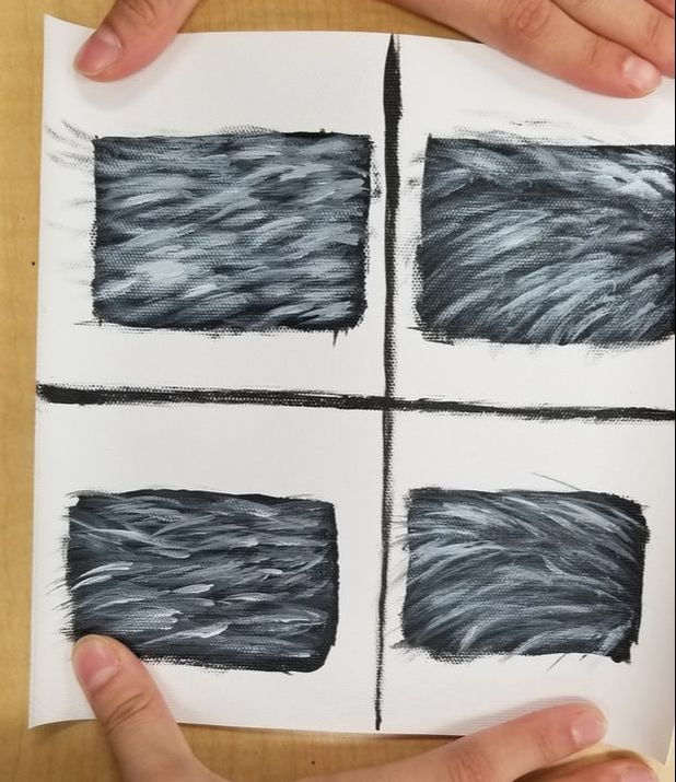
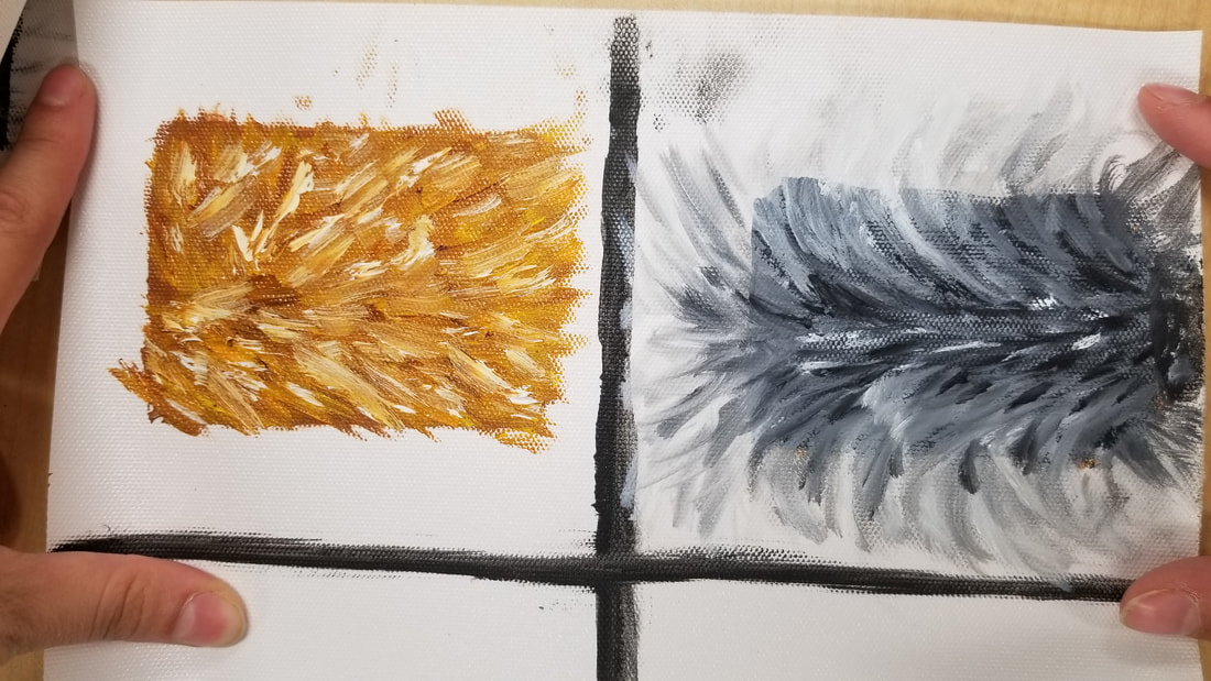
Here are my practice fur paintings. It was a bit useful to practice the fur paintings before I started the final project since I did not really understand how to paint fur. The video we watched was not really any help at all since I did not end up really using the method that was shown, and kind of just did my own thing in terms of method.
|
|
I did not have my sketch of my painting, but this is the closest I have.
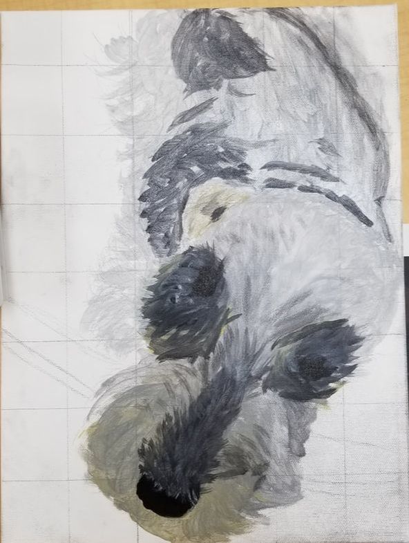
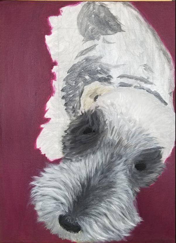
Here are my inprogress photos of my painting.
|
|
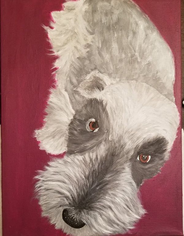
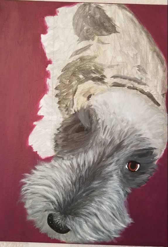
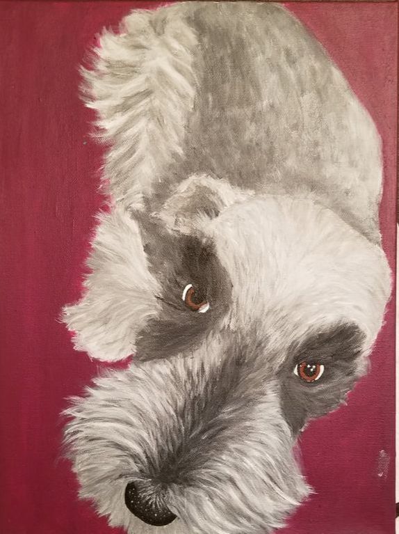
- For this critique I first want you to discuss your painting. Use your own words to describe, analyze, interpret and judge your artwork. Add art vocabulary to make your critique better. There are no questions to guide you so you need to be as in depth as possible. I think this painting has a far amount of attention to detail and depth to it especially in the face area that I focused on. I am quite content with most of the painting, but I think I could add more detail into areas such as the eyes and the leg hair. There is a distinct amount of shadows and highlights that creates depth to my painting and shows the dimension of the hair. I plan on adding more details to my painting, and to get rid of the obvious brush strokes in some parts of my painting.
- Discuss how accomplished value, texture, layering, blending, contrast and realism. What is the most important aesthetic quality of your painting? If you are unsure what aesthetic means then look up the meaning and write it with your critique. The aesthetic of the painting would be of a portrait drawing with a high focus on realistic lighting on the subject. I wanted to make my dog as realistic as I could to my own abilities, and then contrast the very detailed dog with a one color background to really make the dog the focus of the painting. I choose a maroon background color to also give the painting a more formal look to it.
- Explain your creative process. Discuss how you used techniques learned in class to create a successful painting. I kind of learned as I went with this painting. I did not put down layers in terms of dark to light, I instead used thick amounts of paint to blend colors together on the canvas to give it depth. I would add multiple layers of varying shades to get the depth I wanted in the painting. I would then use a light amount of water to try and blend out the acrylic more to get rid of brushstrokes in the painting.
- Reflect your growth through the project. I learned a lot about how to layer acrylic in this project and how to blend it out with water on the painting. This was the first project I really tried with the acrylic paint to put a lot of depth into my painting and spend a lot of time layering the paint. What I mainly learned was how to add layers with brush strokes, and you can see a world of a difference between the practice paintings I did earlier with how realistic the painting looks compared to it.
- Discuss craftsmanship and quality of your painting. I think most areas of my painting show good craftsmanship in term of the depth of my painting with the depth in my panting. I had a wide range of lights and darks to contrast with each other to create that depth. Most of my brush strokes are fairly concise and not too noticeable. I lack some craftsmanship in the eye area and plan on adding more detail into them in the future.
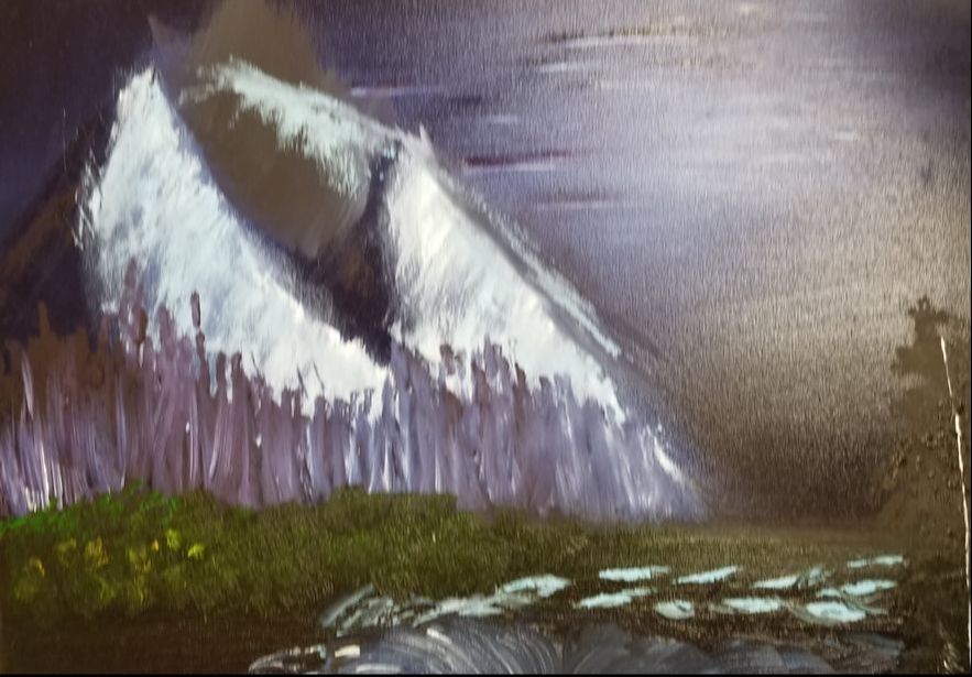
The Bob Ross painting was the most painful thing I have ever done in my life, and it was so terrible. I have never felt more depressed doing a painting than this painting, it was insanely hard to do. Bob Ross went way too fast to follow and did not really show how to do things, so my painting came out terribly. I will never see Bob Ross in the same light I feel as if everything I now know is lies. Wet on wet oil is not as easy as it seems to be made out to be, and Bob Ross vastly understates the difficulty of it.
Overall I thoroughly enjoyed taking painting as a class, and I feel like I really learned a lot from this class. I believe I got much better at painting by the end of it especially just looking at my first watercolor and hundertwasser painting, which were both mediocre compared to my oil landscape and pet portrait. I discovered my favorite medium in this class to be oil paint, and I really enjoyed the painting with it due to the fact that it made more sense to me to blend the paint together on the canvas rather than palatel. I think my landscape painting is one of the best pieces I have created especially since I actually took a lot of time working on it, and really paid attention to the details in it. It was good to learn about most of the major paints even if I did not necessarily like using them. I do not plan on using watercolor or acrylic often, but learning how to use them I believe has helped me improve as an artist. I enjoyed every project I have done in this class even if it came with some hardships, well all of them besides the Bob Ross project. I think this is an important class for people to take if they want to focus on painting, and I am glad I took it this year since painting has always been an interest of mine. I think I would though in the future like to learn more techniques with brush strokes and how to create fine details with it, it would make a good edition in future classes to go over how to correctly create texture also. I think the most important part of the class was the practice we did with mediums before we started the final project, it helped ease anxiety or caring about messing up to try new techniques. I hope to continue my education with oil paints and to use my next art classes to really build on the things I learned in this class
